15 Whole House Paint Schemes I Absolutely Love
Picking a single paint color for a room can be tough, but choosing a cohesive color scheme for your entire house? That can feel downright overwhelming.
A whole-house paint scheme connects your home, creating a beautiful flow from one room to the next. It makes your space feel intentional and put-together.
I’ve spent years experimenting with paint, and I’ve learned that a great palette doesn’t have to be complicated. To help you get started, I’m sharing 15 of my favorite whole-house paint schemes that work beautifully in any home.
1. The Warm Neutral Palette
You can’t go wrong with warm neutrals. I love this scheme because it creates an inviting and cozy atmosphere that feels like a warm hug. It relies on shades of beige, cream, and taupe to build a gentle, welcoming foundation.
For this palette, I often use a soft beige, like Sherwin-Williams’ Accessible Beige, as the primary wall color in main living areas.
Then, I’ll use a slightly darker taupe for an accent wall or in a study to add depth. A creamy off-white for trim and ceilings keeps everything looking bright and clean.
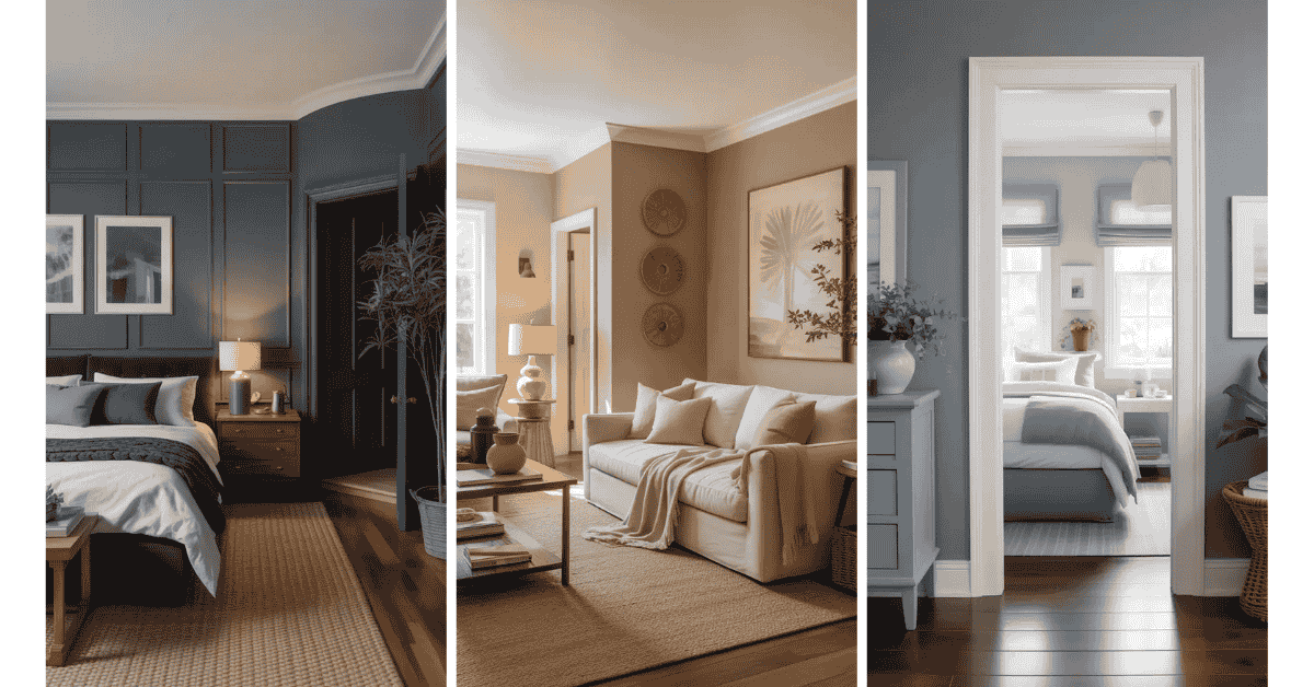
2. The Cool and Calm Scheme
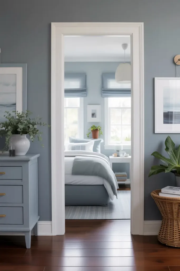
If you’re aiming for a serene and peaceful vibe, a cool-toned palette is the way to go. I use this scheme to make spaces feel larger, brighter, and more tranquil. Think soft grays, muted blues, and crisp whites.
A light gray, like Benjamin Moore’s Gray Owl, is a fantastic main color. I pair it with a subtle blue-gray, like their Smoke color, in bedrooms or bathrooms for a spa-like feel. Crisp white trim makes the cool tones pop, creating a clean, modern look.
3. The Earthy Greens Collection
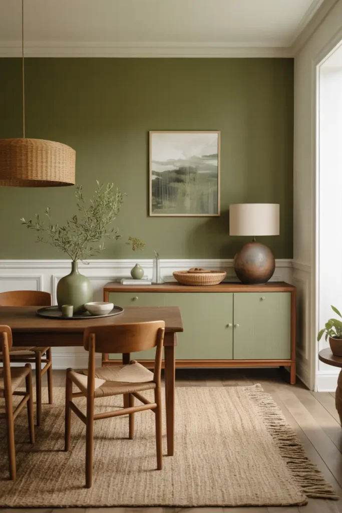
I love bringing the outdoors in, and an earthy green palette is the perfect way to do it. This scheme uses shades of sage, olive, and forest green to create a space that feels grounded, natural, and refreshing.
For a primary color, I recommend a soft sage green, which is calming without being boring. An olive green accent wall in a dining room or office adds a touch of drama. I always pair these greens with a warm white trim to keep the overall look light and airy.
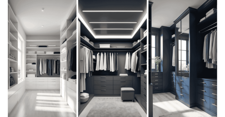
4. The Modern Monochrome Look
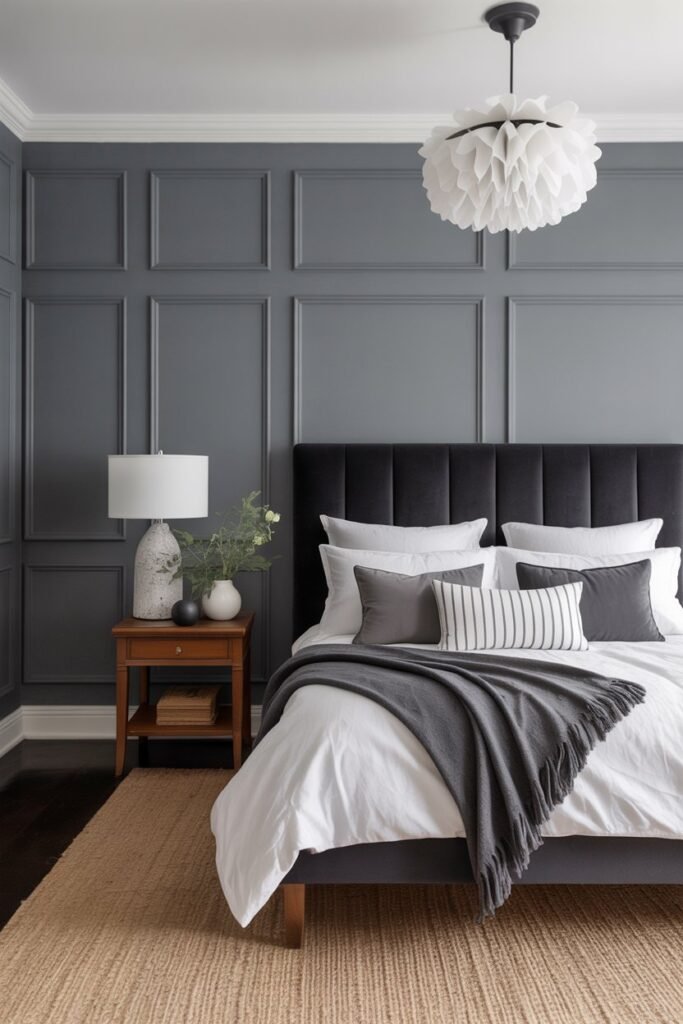
For a bold and sophisticated statement, I often turn to a monochrome palette. This scheme isn’t just black and white; it explores the full spectrum of grays in between. It’s chic, timeless, and surprisingly versatile.
I typically use a medium gray on the main walls and a dramatic charcoal or even black for an accent wall, like behind a headboard in a bedroom. To prevent the space from feeling too cold, I make sure to use a clean, bright white for the trim and ceilings.
5. The Coastal Breeze Palette
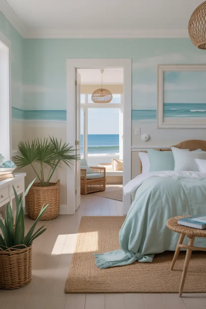
You don’t need to live by the sea to enjoy a coastal-inspired home. I create this airy and relaxed feel using sandy beiges, soft aquas, and seafoam greens. It’s all about capturing that light, breezy feeling of a day at the beach.
I’ll start with a sandy beige for the main living spaces to mimic the look of a beach. Then, I’ll bring in a soft aqua or light blue in bathrooms and bedrooms for a pop of watery color. A pure white trim enhances the clean, fresh aesthetic.
6. The Jewel-Toned Drama
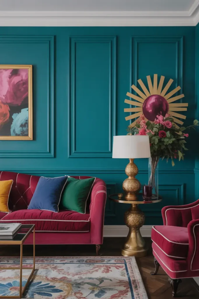
For those who aren’t afraid of color, a jewel-toned palette can be absolutely stunning. I use this scheme to create a rich, luxurious, and energetic environment. Think deep emeralds, sapphires, and rubies.
Because these colors are so bold, I often use them as accent walls in a room with a neutral base, like a soft gray. For instance, a sapphire blue accent wall in a living room can be breathtaking. Pairing these deep colors with a bright white trim creates a striking contrast that feels very high-end.
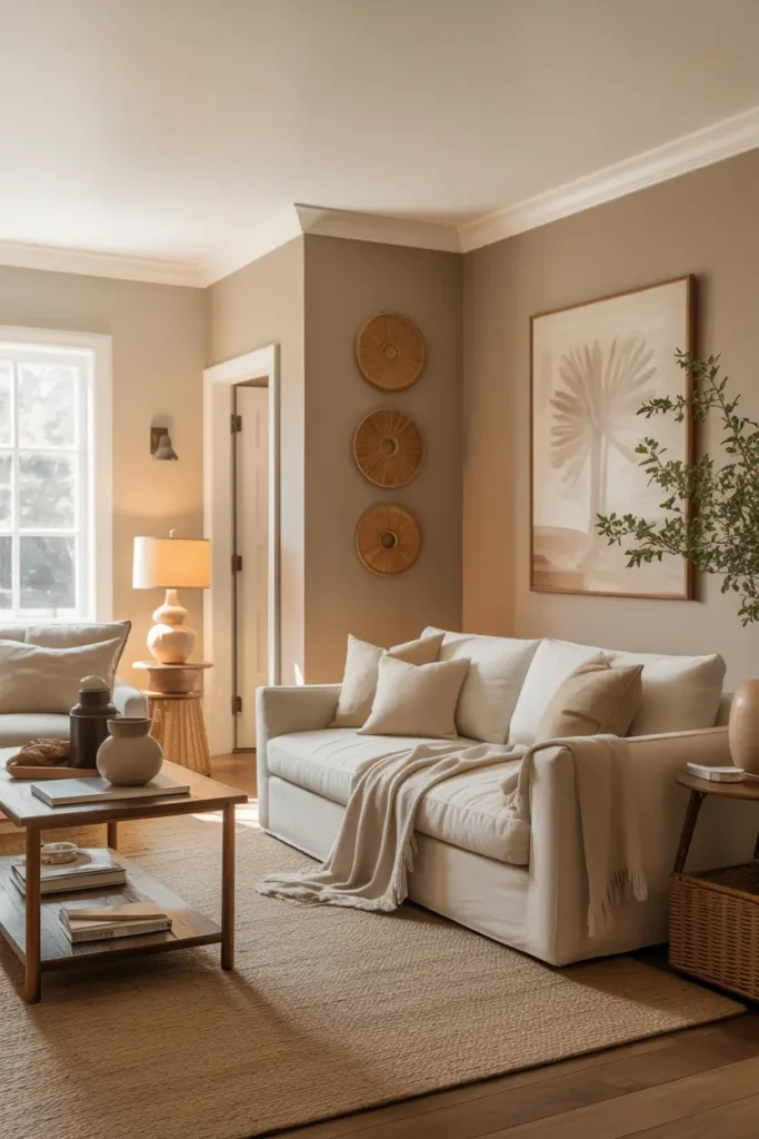
7. The Sun-Kissed Desert Scheme
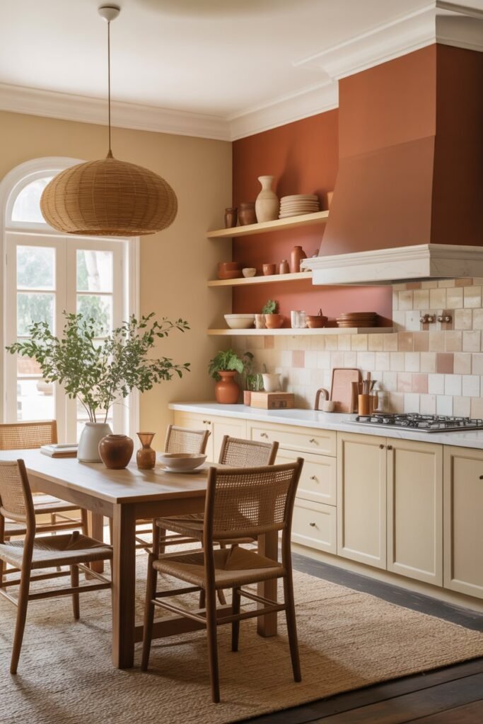
Inspired by the warm, rustic colors of the desert, this palette is perfect for creating a warm and inviting space. I use shades of terra cotta, soft peach, and sandy beige to evoke the feeling of a desert sunset.
A soft, sandy beige works well as the main color. I then use terra cotta as a feature color in a kitchen or dining area to add warmth and personality. Creamy white trim complements these earthy tones beautifully, keeping the look soft and natural.
8. The Scandinavian Simplicity
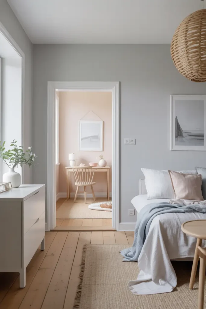
The Scandinavian approach is all about simplicity, light, and functionality. I love this palette for its clean, minimalist feel. It primarily uses shades of white, light gray, and subtle pastels.
I’ll often use a crisp, clean white, like Benjamin Moore’s Chantilly Lace, for almost every wall. This maximizes natural light and creates a sense of openness. For a gentle touch of color, I might add a pale blush or a light dusty blue on an accent wall or in a child’s room.
9. The Timeless Blue and White
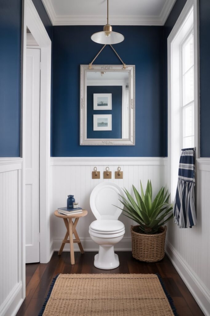
There’s a reason blue and white is a classic combination. It’s fresh, clean, and incredibly versatile. I use this palette to create a look that can be anything from traditional to coastal to modern, depending on the shades you choose.
A classic navy blue, like Sherwin-Williams’ Naval, makes a powerful statement on an accent wall or in a powder room. I balance this deep color with a bright, clean white on the surrounding walls and trim to keep the space from feeling too dark.
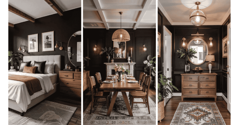
10. The Moody and Mysterious Palette
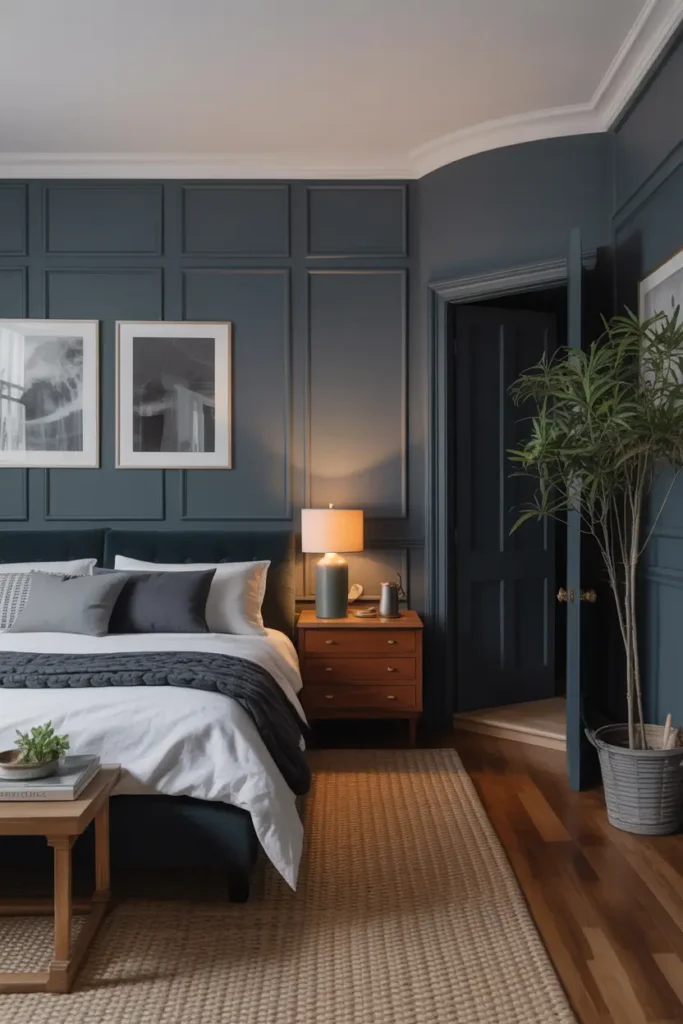
For a cozy, intimate, and dramatic feel, I go for a moody palette. This scheme uses deep, saturated colors like charcoal, navy, and dark green to create a sophisticated and enveloping space.
I often use a deep charcoal gray or a rich navy as the main color in a study, media room, or bedroom. It sounds intimidating, but a dark color can make a room feel incredibly cozy. To balance the darkness, I use plenty of good lighting and a lighter neutral on the ceiling.
11. The Soft Pastel Dream
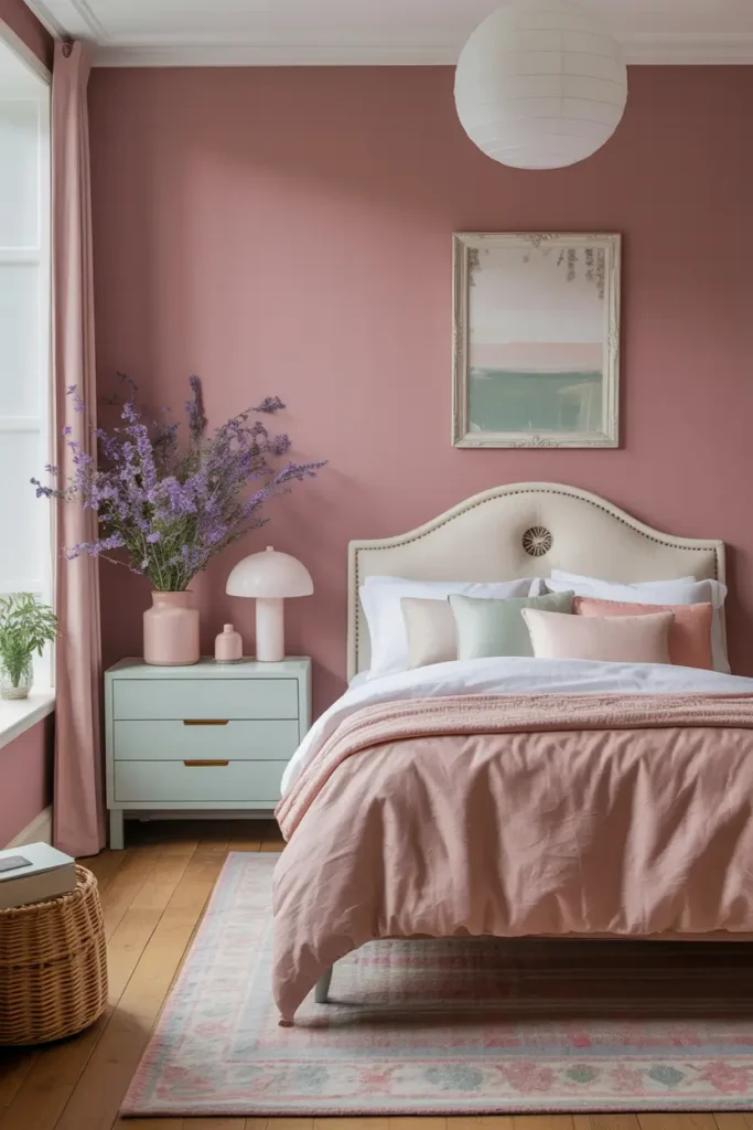
Pastels aren’t just for kids’ rooms! When used correctly, a soft pastel palette can create a sophisticated and calming atmosphere. I use shades of dusty rose, pale mint, and soft lavender for a gentle and elegant look.
I recommend choosing one primary pastel, like a dusty rose, for a bedroom or living area. Then, use a creamy white for the other walls to keep the look grown-up. This approach adds a touch of color without overwhelming the space.
12. The Industrial Loft Vibe
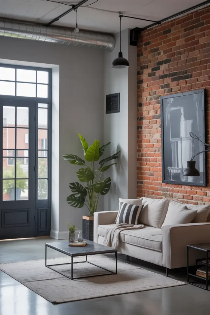
Inspired by urban lofts, this palette is all about raw, edgy, and functional style. I use shades of gray, exposed brick tones, and blacks to create a look that feels both modern and historic.
A concrete-inspired gray is a great base for the main walls. I often suggest leaving or adding a brick accent wall for texture and warmth. Black trim and doors can add to the industrial feel, creating sharp lines and a bold statement.
13. The Cheerful Yellow and Gray
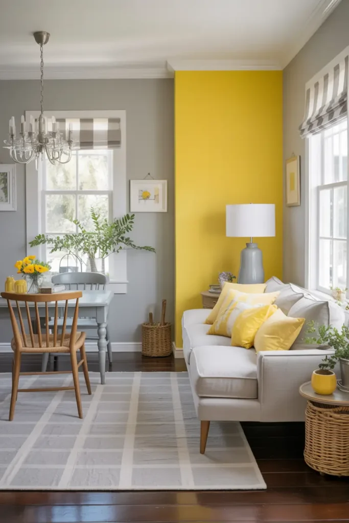
This combination is a modern classic for a reason. I love how the optimistic energy of yellow plays against the calm stability of gray. It’s a palette that feels both happy and sophisticated.
I use a soft, light gray as the neutral foundation for the home. Then, I bring in pops of a sunny, cheerful yellow on an accent wall, in a breakfast nook, or through home decor. It’s a great way to add a dose of personality and light.
14. The Rich Chocolate and Cream
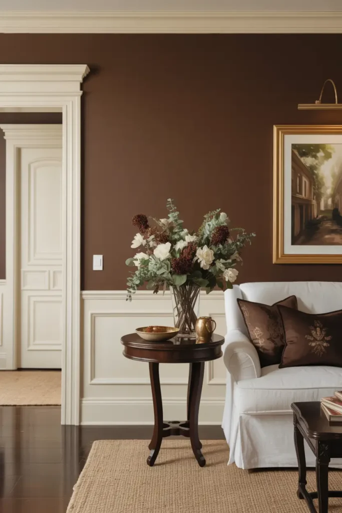
For a look that feels decadent, warm, and traditional, I turn to a palette of rich brown and cream. This scheme creates a cozy and luxurious environment that is perfect for a classic home.
I use a deep chocolate brown for an accent wall in a living room or as the main color in a formal dining room. To balance this richness, I pair it with a warm, creamy off-white for the other walls and trim. The contrast is elegant and timeless.
15. The Bold and Eclectic Mix
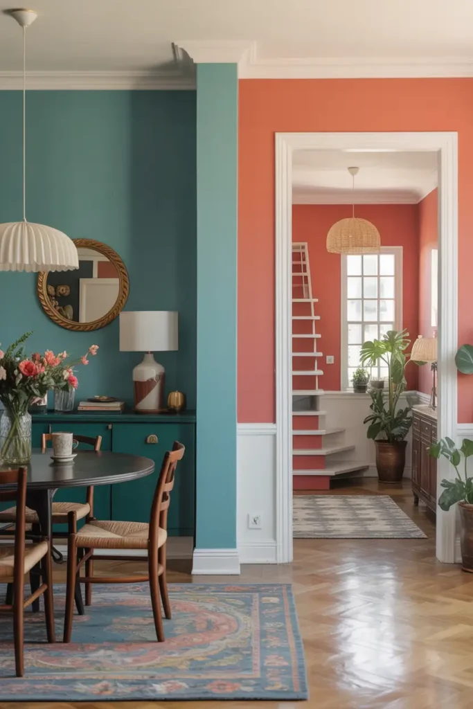
Sometimes, the best palette is one that breaks the rules. I love working with clients who want to create a home that is uniquely theirs with a bold and eclectic mix of colors. This is all about expressing personality.
The key to making an eclectic palette work is to have a connecting thread. This could be a consistent trim color (like a clean white) or a shared undertone among the different colors. For example, you could have a teal dining room and a coral entryway, but both colors have a similar muted quality.
Conclusion
Creating a whole-house paint scheme is a fantastic way to unify your home and express your personal style. If you’re still not sure where to start, consider booking a color consultation. A professional can help you choose the perfect palette that you’ll love for years to come.