18 Playroom Paint Colors to Spark Joy and Creativity
When I decided to create a dedicated playroom, I knew the paint color would be the most important decision. The right shade can do more than just decorate a wall;
it can set the mood, spark imagination, and create a space where my kids’ creativity can run wild. A playroom should be a magical escape, a place for both energetic play and quiet focus.
After exploring countless options, I’ve gathered 18 fantastic color schemes perfect for any playroom.
Whether you want something bold and bright or soft and calming, this list will help you find the perfect palette to create a space your kids will adore for years to come.
1. Confetti Color
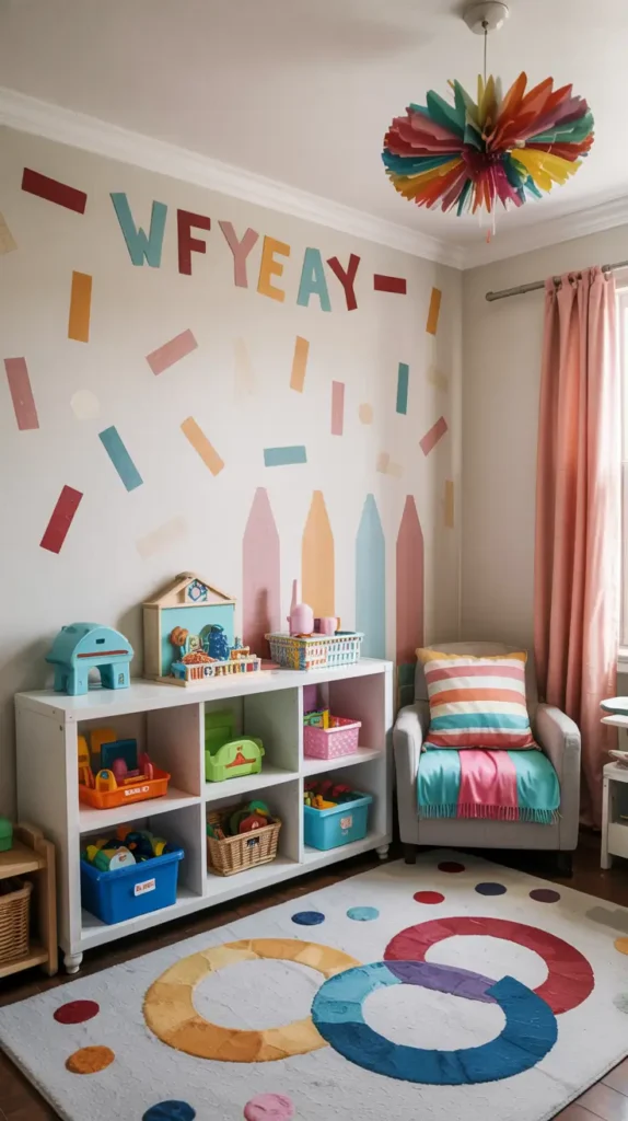
For a room that feels like a constant celebration, I love the idea of a confetti-inspired theme. This isn’t about one single paint color, but rather using a neutral backdrop, like a crisp white, and adding pops of rainbow colors through decals or stencils.
This approach is incredibly versatile. You can pull in colors from furniture, toys, and pillows, creating a cohesive yet playful look. It’s an easy way to design a vibrant space that feels fun and full of energy, just like a party.
2. Primary Punch

You can’t go wrong with the classic primary colors: red, yellow, and blue. They’ve been a staple in kids’ spaces for years because they are stimulating and fun. To give this traditional palette a modern twist, I pair it with a generous amount of bright white.
Painting the walls a cool, crisp white creates a clean canvas that makes the bold primary accents pop. This prevents the room from feeling overwhelming and gives it a fresh, airy feel while still celebrating those timeless, energetic hues.
3. Bumblebee Inspired
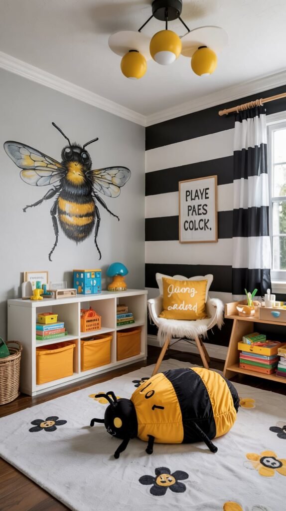
I adore the cheerful combination of black, white, and yellow. It’s a palette that takes its cues from nature’s busiest pollinator and feels both playful and surprisingly chic. The clean white base brightens the room, while the black adds a touch of graphic sophistication.
Pops of sunny yellow bring in a dose of happiness. You can keep the decor simple with just these three colors for a more modern look, or add other bright accents to create an even more youthful and eclectic space.
4. Blushing Blooms
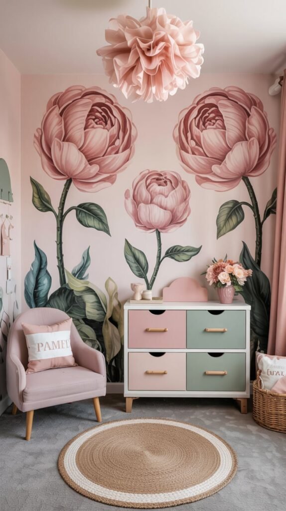
For a softer, more whimsical feel, I recommend a palette inspired by a cottage garden. A soft blush pink serves as the primary color, creating a warm and gentle atmosphere. This isn’t the bubblegum pink of the past; it’s a more muted, sophisticated shade.
To bring the garden theme to life, I add accents of verdant green, muted aqua, and a hint of peach. This combination feels feminine and sweet without being overly sugary, creating a calm and imaginative space for quiet play.
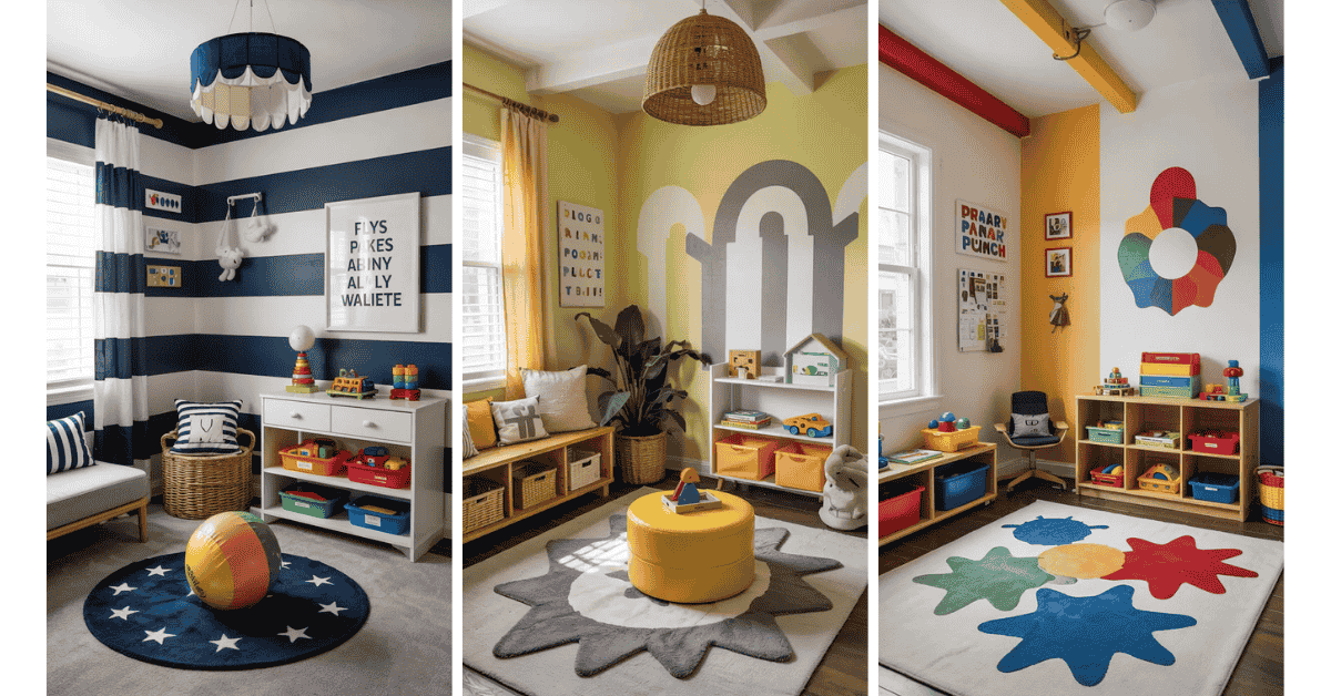
5. Navy + White
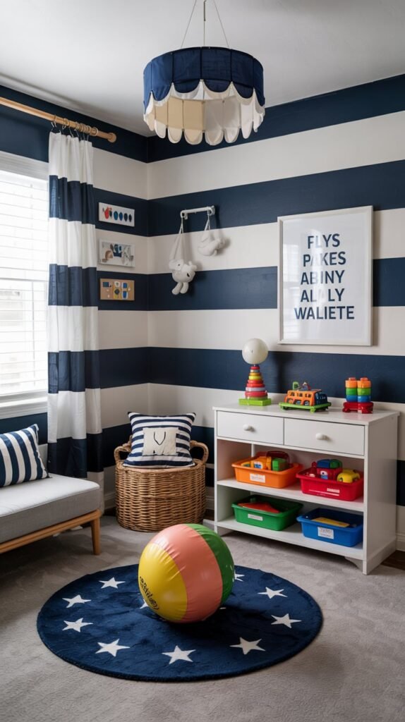
A navy and white pairing is a classic for a reason. It’s timeless and can easily transition as your child grows. For a playroom, I like to use this combination to create a bold, graphic statement, like navy and white striped walls.
The beauty of this palette is its versatility. You can keep it nautical and crisp, or you can add vibrant, multicolored accessories to make it feel more kid-friendly and fun. The strong contrast provides a great backdrop for colorful toys and artwork.
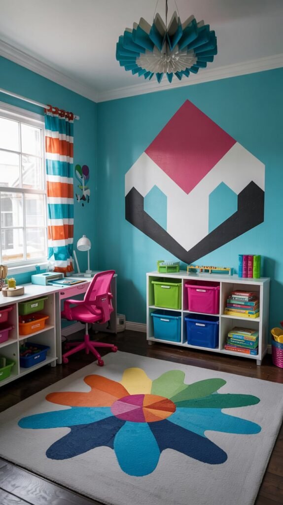
6. Retro Flair
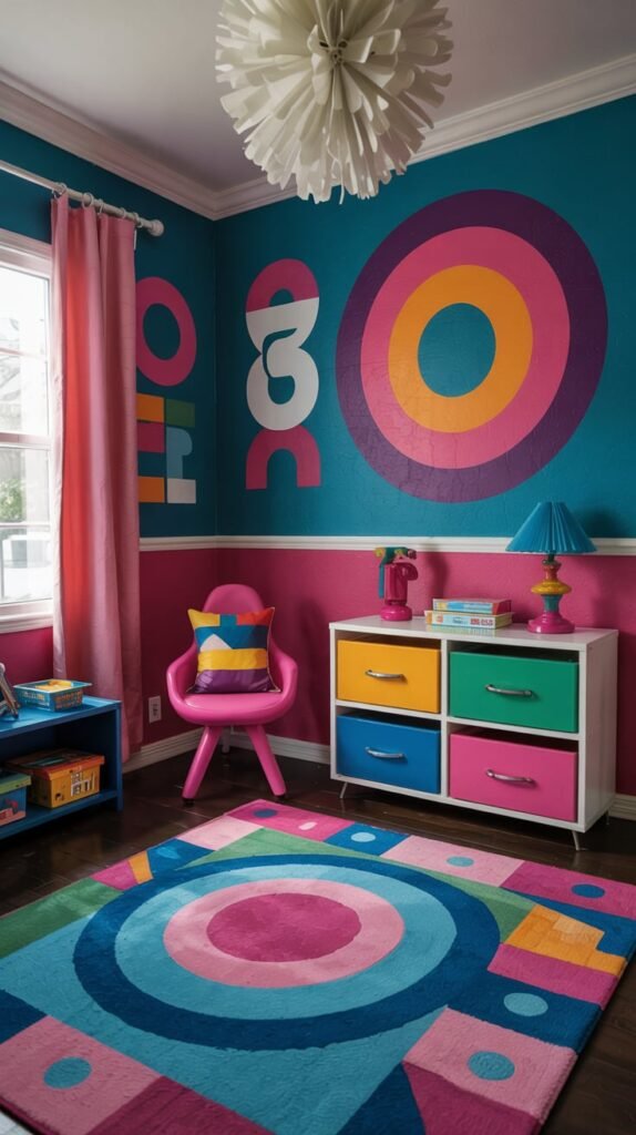
I love the energy of an ’80s-inspired color scheme. Pairing deep teal with hot pink creates a look that is full of spunk and creativity. These vibrant, punchy colors are perfect for a playroom designed to inspire big ideas and active fun.
To keep the palette from feeling too chaotic, I ground it with deep navy and bright white accents. The graphic patterns often associated with this era, like geometric shapes, work incredibly well and add another layer of visual interest.
7. City Chic
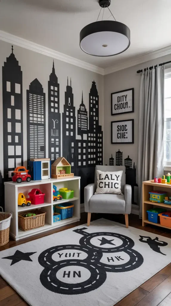
A classic black-and-white color scheme is perfect for a modern, urban-inspired playroom. It’s a sophisticated palette that feels both timeless and cool. I like to play up the theme with bold, graphic patterns or even a cityscape wall decal.
One of the biggest advantages of this color scheme is its longevity. It’s a look that won’t feel dated as your child grows, eliminating the need to repaint every few years. You can easily update the room’s feel by swapping out accent colors in toys and textiles.
8. Margarita Yellow
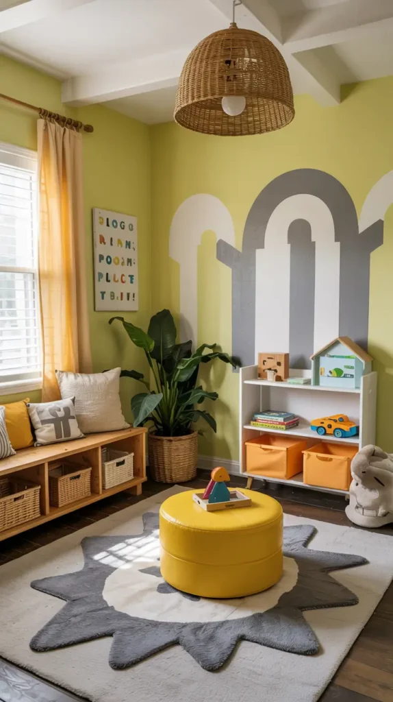
For a shared play space, I often suggest a cheerful and gender-neutral lemon-lime hue. This color, which I call Margarita Yellow, is bright and happy, instantly making a room feel sunny and inviting. It’s vibrant without being overwhelming.
I pair this cheery color with other neutrals like gray or beige to keep the space balanced. Adding textural elements like a shaggy rug, knit pillows, and soft blankets will add depth and coziness to the bright and energetic room.
9. Lovely in Lilac
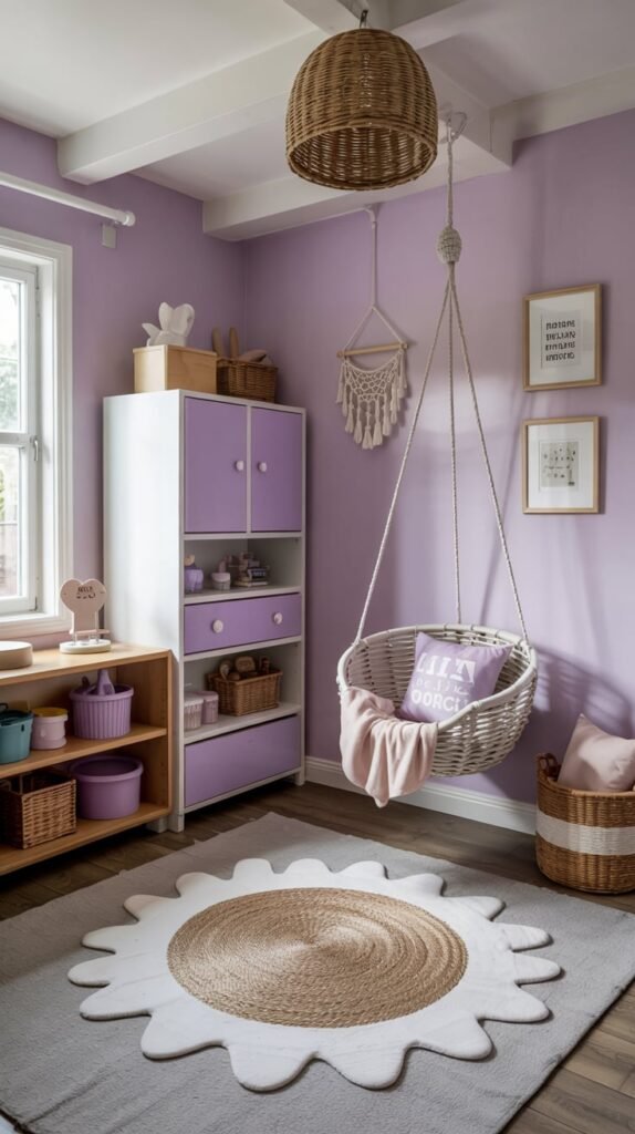
Lilac is a beautiful choice for a playroom that feels both feminine and sophisticated. When paired with bright white, this soft purple hue feels modern, fresh, and upbeat. It creates a calming atmosphere that’s perfect for both play and relaxation.
To add warmth to this cool-toned palette, I incorporate natural touches. Light-hued wood furniture, rope details on a hanging chair, or woven baskets bring an earthy element that beautifully complements the lovely lilac walls.
10. Superhero-Inspired
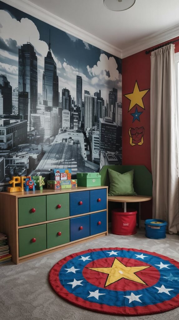
To create a space fit for a superhero, I turn to a powerful palette of Kelly green, navy, and red. These bold colors, often found in classic comic books, create an energetic and adventurous atmosphere.
I find that this color scheme works best when grounded by a neutral backdrop. A cityscape wall mural is a perfect choice, providing an exciting setting for countless superhero adventures while tying the bold colors together.
11. Zoo Whimsy
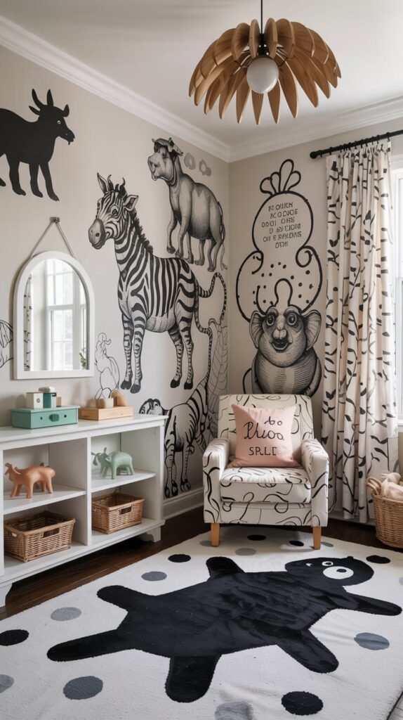
I take a whimsical approach to the classic black-and-white palette by incorporating a zoo animal theme. Dainty line drawings of animals on the walls or in textiles make the high-contrast combination feel playful and exciting.
This look is all about quirky accents and embracing a bit of fun. To soften the harsh contrast of black and white, I like to add small touches of a soft color, like a pale blush or a muted mint green, in the accessories.
12. Desert Tones
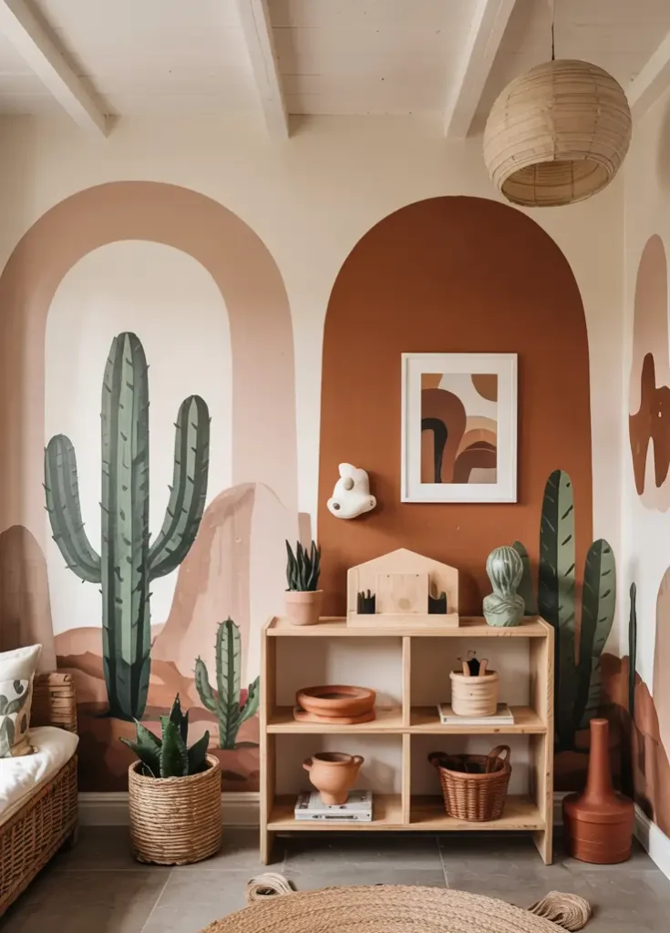
For a warm and earthy playroom, I draw inspiration from the desert. A palette of cactus greens and sun-baked browns creates a calming and natural environment. This color scheme is both modern and timeless.
Plant-themed prints and natural materials like terra-cotta pots work beautifully with this look. To add a touch of modern flair and contrast, I incorporate matte black accents in lighting fixtures or furniture hardware.
13. Vibrant Aqua
A bold shade of aqua blue is a fantastic choice for a playroom. This color is happy and energizing, but its cool undertones also provide a sense of calm. It’s a versatile hue that works well for kids of all ages.
I love pairing vibrant aqua with other bright jewel tones as accent colors. Think magenta, emerald, or sapphire. These rich colors create a lively and dynamic space that sparks creativity and fun.
14. Nature’s Neutrals
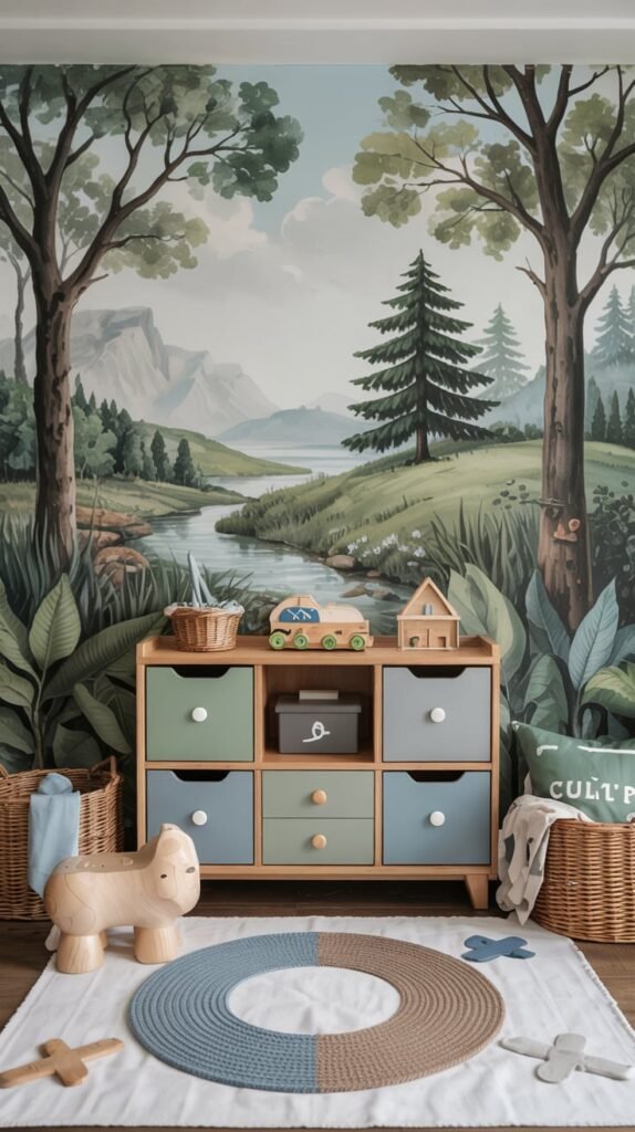
I often look to the outdoors for color inspiration. Nature’s neutrals—shades of blue, green, gray, and brown—are naturally harmonious and create a serene and grounded space. This palette is perfect for a calming playroom.
These agreeable colors are easy to work with and play well together, requiring little design effort to look good. Best of all, this is a color scheme that will easily age with your child, providing a timeless backdrop for years to come.
15. Very Berry
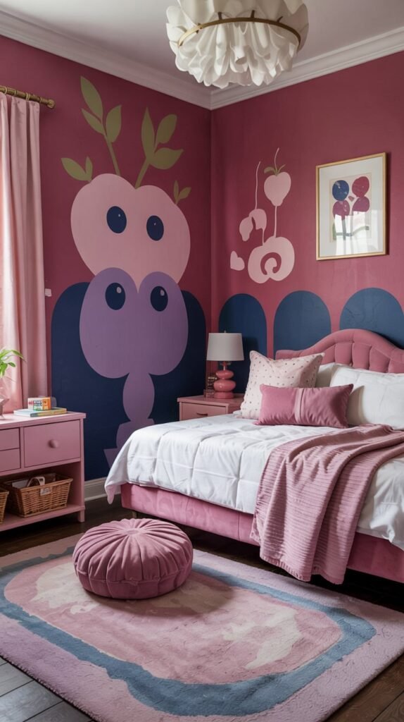
For a sweet and delectable combination, I pair raspberry with blueberry. These two colors work so well together because they share purple undertones, creating a rich and cohesive look. It’s a sophisticated take on a pink and blue room.
To make this palette feel warm and inviting, I make sure to incorporate plenty of texture. A plush rug, velvet pillows, and soft knit blankets add a layer of coziness that makes the room feel rich and comfortable.
16. Citrus Hues
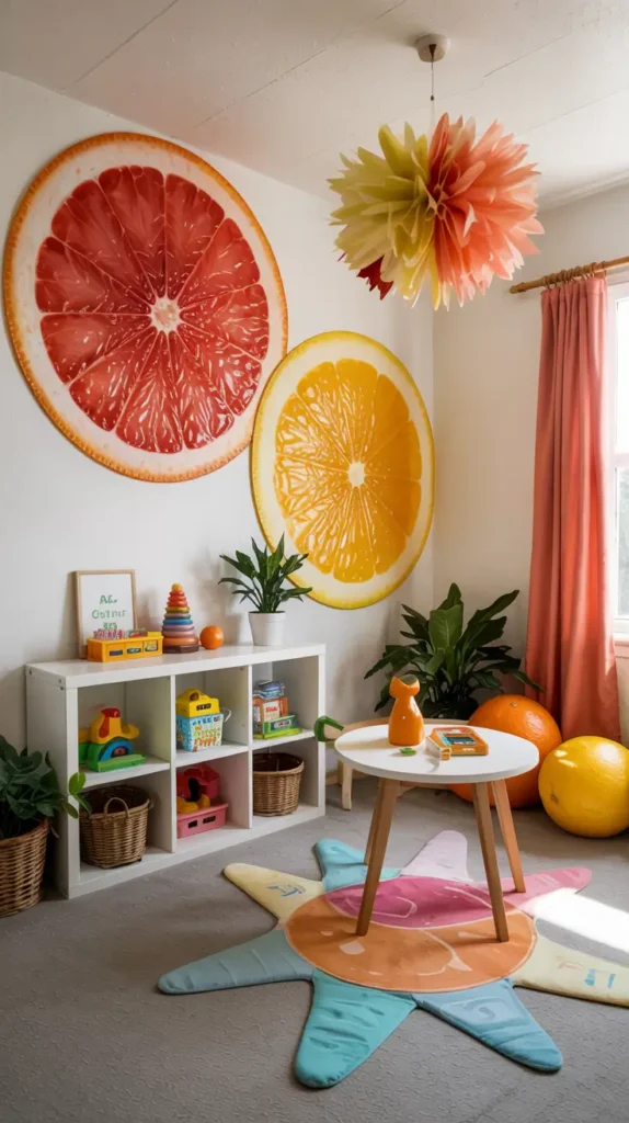
If you want to infuse a playroom with pure energy, citrus hues are the way to go. I love combining shades of grapefruit pink, lemon yellow, and tangerine orange to create a space that feels zesty and full of life.
A clean, crisp white is the perfect partner for this fresh-squeezed palette. It provides a bright backdrop that allows the zingy citrus tones to truly shine, resulting in a light-filled and joyful room.
17. Flamingo Pink + Tropical Teal
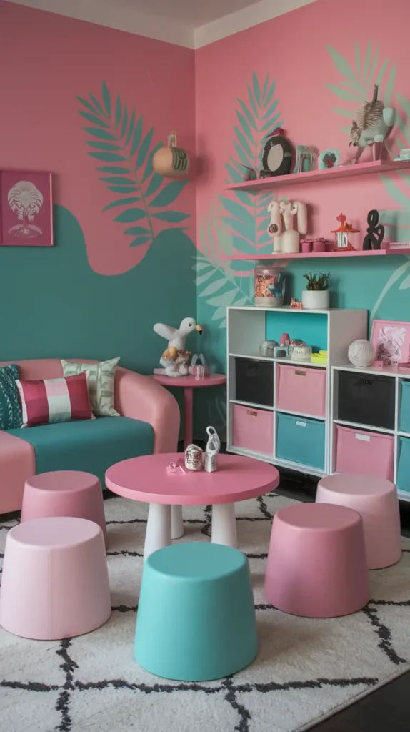
This trendy and fun color palette is inspired by a flamingo in tropical waters. The combination of cheerful pink and vibrant teal is playful and full of personality. It instantly creates a fun, vacation-like vibe.
To ground this lively palette, I use bright white and crisp black as a backdrop. These neutral colors, drawn from the flamingo’s face, balance the bright hues and add a touch of modern sophistication to the tropical theme.
18. Stormy Blues
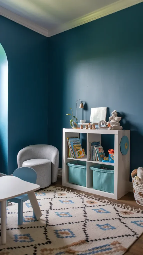
For a more sophisticated and moody kids’ space, I suggest using deep, subdued color tones. Moody blues, reminiscent of a stormy sea, create a calm and cozy atmosphere that’s perfect for a reading nook or a quiet play area.
I use a variation of the same blue—from light to dark—to add depth and keep the space interesting. Balancing these deep blues with a calming neutral like a soft gray or warm white prevents the room from feeling too dark and creates a beautifully balanced space.
Conclusion
Choosing the right color for your playroom is the first step in creating a space where your child’s imagination can flourish.
If you’re ready to bring your vision to life, visit a local Benjamin Moore store to explore these colors and find the perfect paint for your project.