20 Grey Two Tone Deck Ideas for a Stunning Outdoor Space
When I decided to upgrade my outdoor space, I knew I wanted something modern yet timeless. That’s when I discovered the beauty of grey two-tone decks.
Using two shades of grey adds depth, creates visual interest, and gives your deck a custom-designed look without a complicated process.
In this guide, I’ll walk you through 20 inspiring grey two-tone deck ideas that can transform your backyard into a stunning retreat.
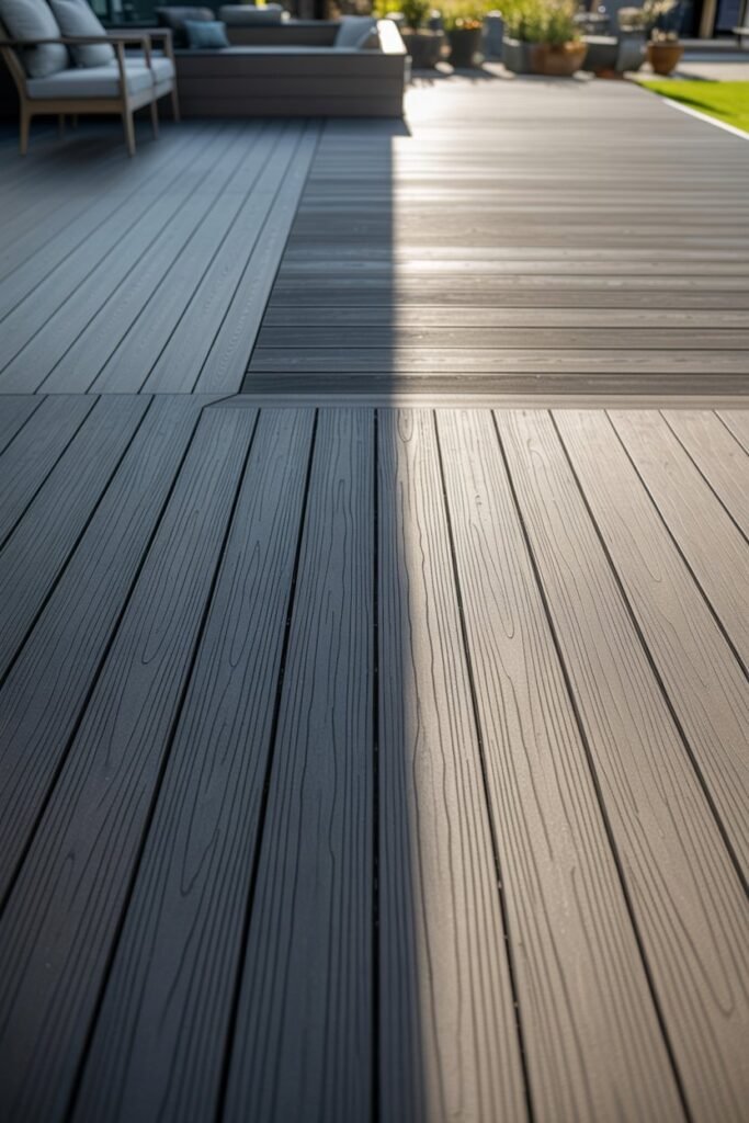
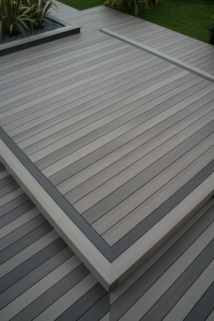
1. Classic Light and Dark Grey Combo
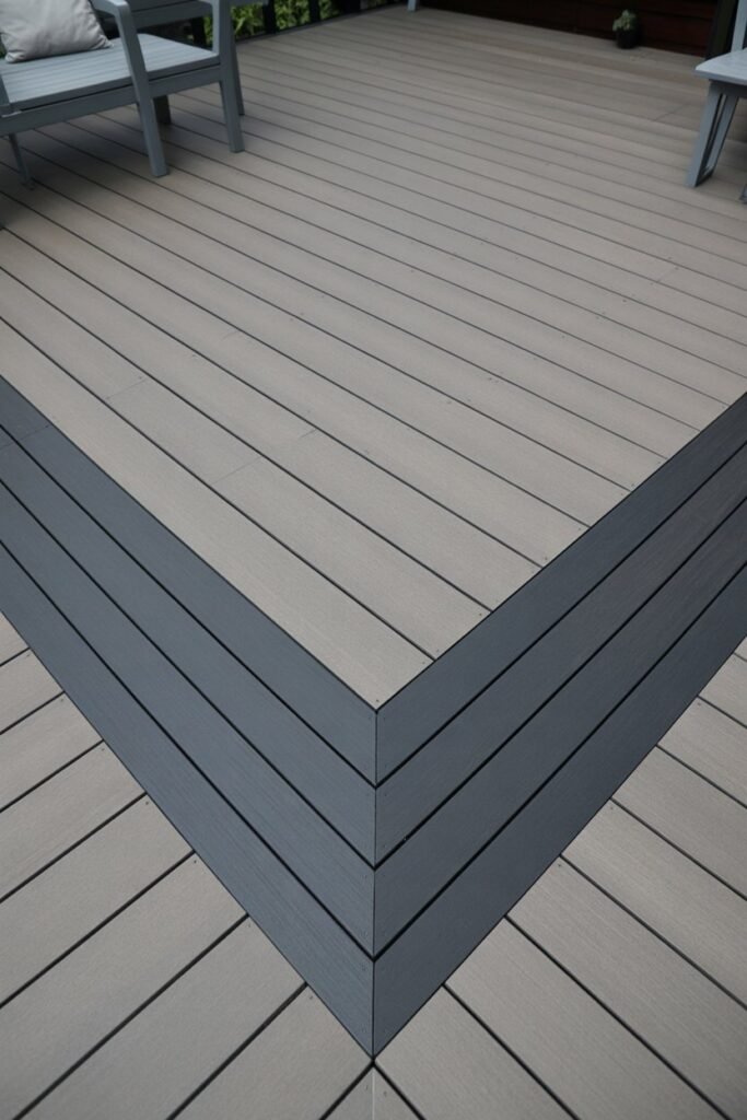
I started with a classic for a reason. Pairing a light grey for the main deck boards with a dark charcoal grey for the border is a foolproof way to achieve a sophisticated look. This contrast clearly defines the space and gives it a clean, polished finish.
This design works especially well for large decks, as the darker border helps to frame the area, making it feel more intimate and organized. I find that this combination is incredibly versatile and pairs well with almost any outdoor furniture style.
2. The Checkerboard Effect
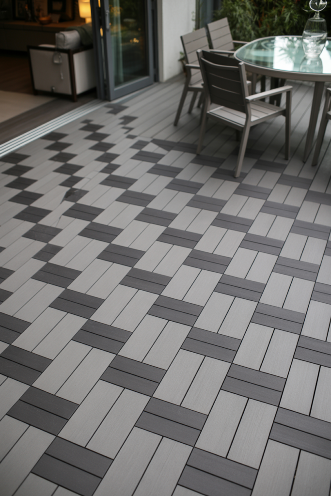
For a more playful and unique design, I tried alternating light and dark grey deck boards to create a subtle checkerboard pattern. This isn’t as bold as a traditional black and white checkerboard but offers a dynamic texture that catches the eye.
This approach is perfect if you want to make a statement without overwhelming your outdoor decor. It’s a great way to add personality to your deck, and I noticed it cleverly hides minor scuffs and dirt.
3. Grey with a Touch of Greige
“Greige,” a mix of grey and beige, is a fantastic warm neutral to pair with a cooler, true grey. I used a cool, dark grey for the main decking and a warmer greige for accent areas like steps and railing tops.
This combination creates a harmonious balance between cool and warm tones, making the space feel inviting and cozy. It’s an excellent choice if you find traditional grey a bit too cold for your taste.
4. Vertical and Horizontal Contrasts
I experimented with the direction of the boards to create contrast. By laying the inner deck boards horizontally in a light grey and the border boards vertically in a dark grey, I created a visually interesting frame.
This technique not only adds a custom touch but can also make your deck appear wider or longer, depending on the direction you choose. It’s a simple trick with a significant impact on the overall design.
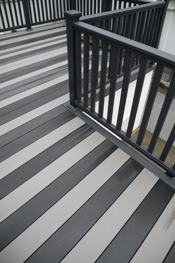
5. Subtle Stripes
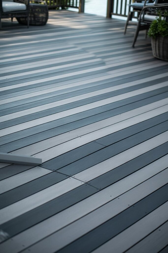
Instead of a bold contrast, I opted for a more subtle striped effect. I used two shades of grey that were very close in tone, like a dove grey and a slate grey, and laid them in a repeating pattern.
The result is a gentle, flowing look that adds texture without being too busy. This is perfect for creating a serene and calming atmosphere in your outdoor oasis.
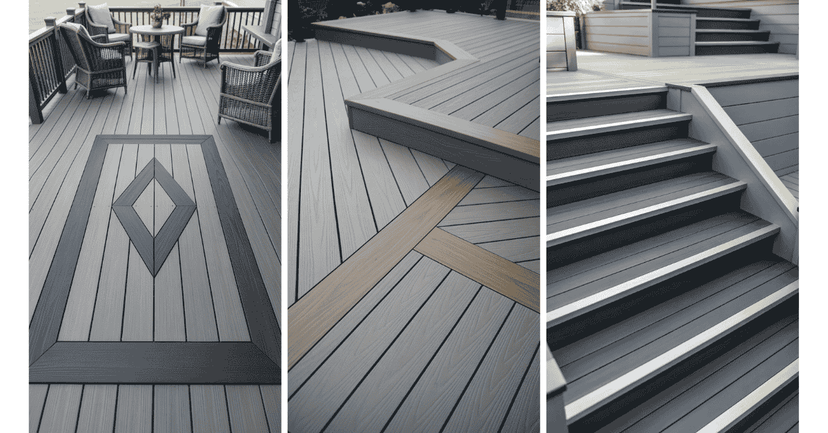
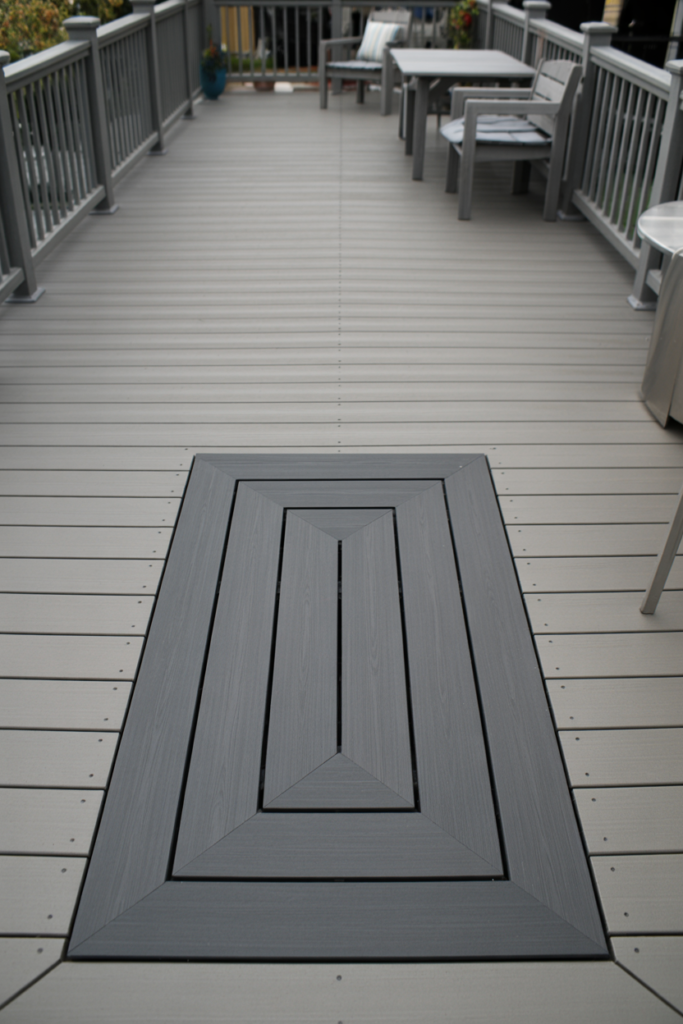
6. Picture Frame with an Inlay
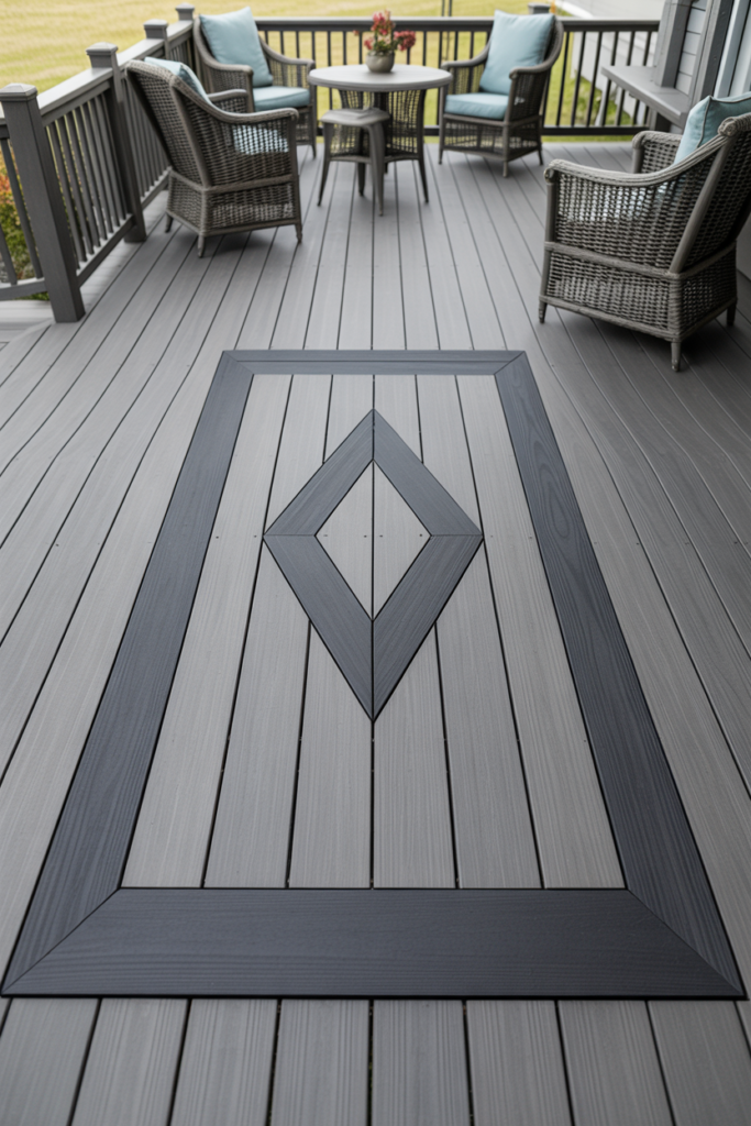
To take the classic border design up a notch, I added an inlay. The main deck was a medium grey, bordered by a dark charcoal. Inside this “picture frame,” I created a diamond-shaped inlay using the same dark charcoal grey.
This is a surefire way to create a focal point and add a touch of luxury to your deck. It looks especially impressive in the center of a seating area.
7. Grey and Weathered Wood Tones
I decided to mix composite grey decking with the look of weathered wood. I used a primary cool grey for most of the deck and then added accent boards with a grey-brown, wood-grain finish.
This combination gives the deck a rustic-modern feel, blending the sleekness of grey with the natural charm of wood. It’s a great way to soften the modern edge of an all-grey design.
8. Contrasting Treads and Risers
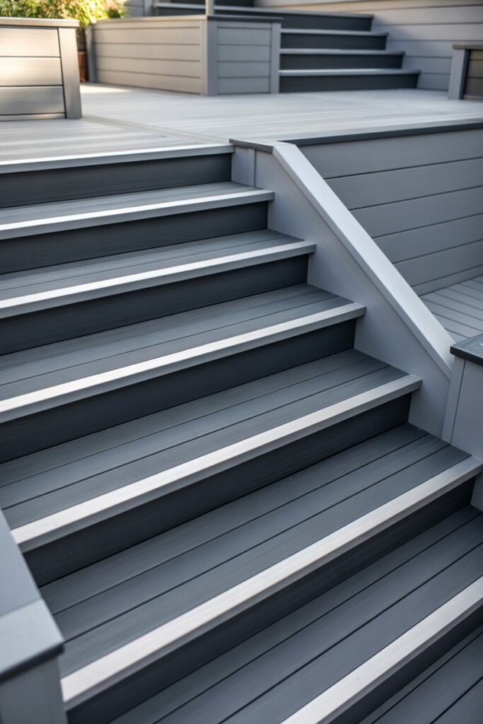
For my multi-level deck, I focused on the stairs. I used a dark, slate grey for the stair treads (the part you step on) and a much lighter, silver grey for the risers (the vertical part).
This not only looks fantastic but also improves safety by making the edge of each step more visible. It’s a practical and stylish choice that adds dimension to your deck’s structure.
9. Geometric Patterns
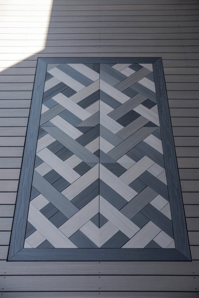
Feeling creative, I used two shades of grey to create a geometric pattern, like a herringbone or chevron design, in the center of the deck. I framed this patterned section with a solid, darker grey border.
This is a high-impact idea that turns your deck floor into a work of art. It’s a bit more work, but the stunning result is well worth the effort.
10. A Grey Ombré Effect
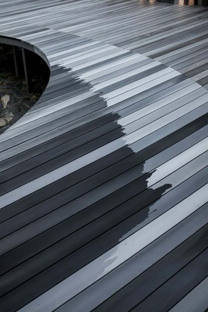
For a truly unique look, I created an ombré or gradient effect. I started with a dark charcoal grey on one end of the deck and gradually transitioned to a pale, silvery grey on the other end. This required using three to four shades of grey.
The transition creates a beautiful, flowing visual that is both modern and artistic. This design is a real conversation starter and makes the deck feel dynamic and expansive.
11. Highlight the Railings
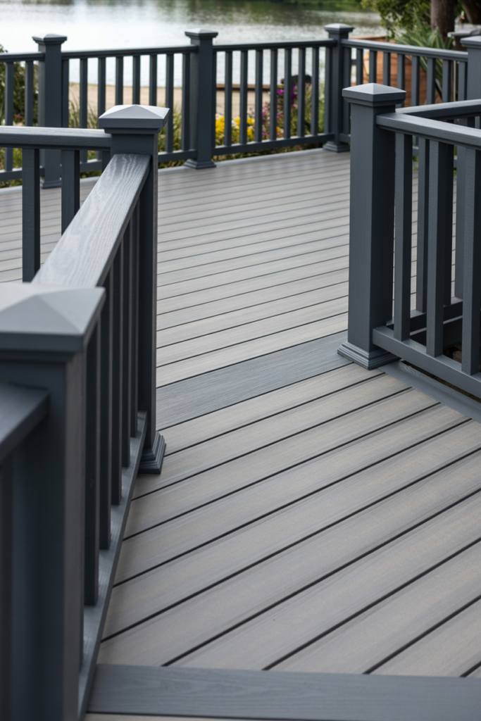
I decided to make the railings a key feature. I used a light grey for all the deck boards and then chose a starkly contrasting dark grey for the railings and posts.
This draws the eye upward and frames the view beyond your deck. It’s an effective way to make a smaller deck feel more defined and structured.
12. Separate Zones with Color
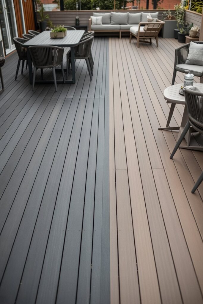
On my larger deck, I used two tones of grey to define different functional zones. A darker grey marked out the dining area, while a lighter grey was used for the lounging and seating space.
This is a clever way to create the feeling of separate “rooms” without needing walls or physical dividers. It helps organize the space and makes it feel more purposeful.
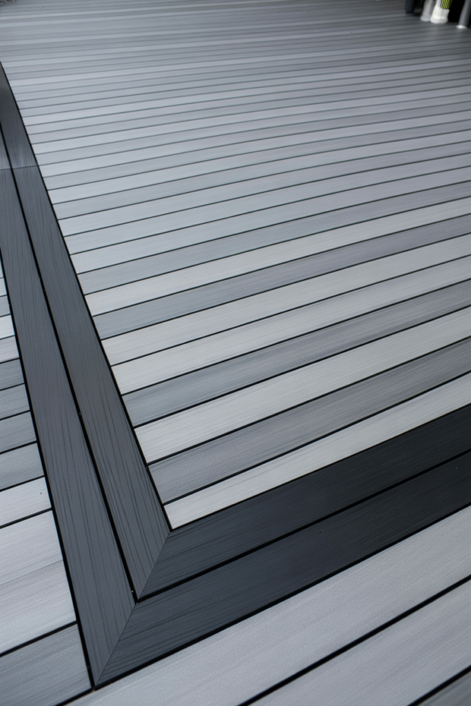
13. Focus on the Fascia
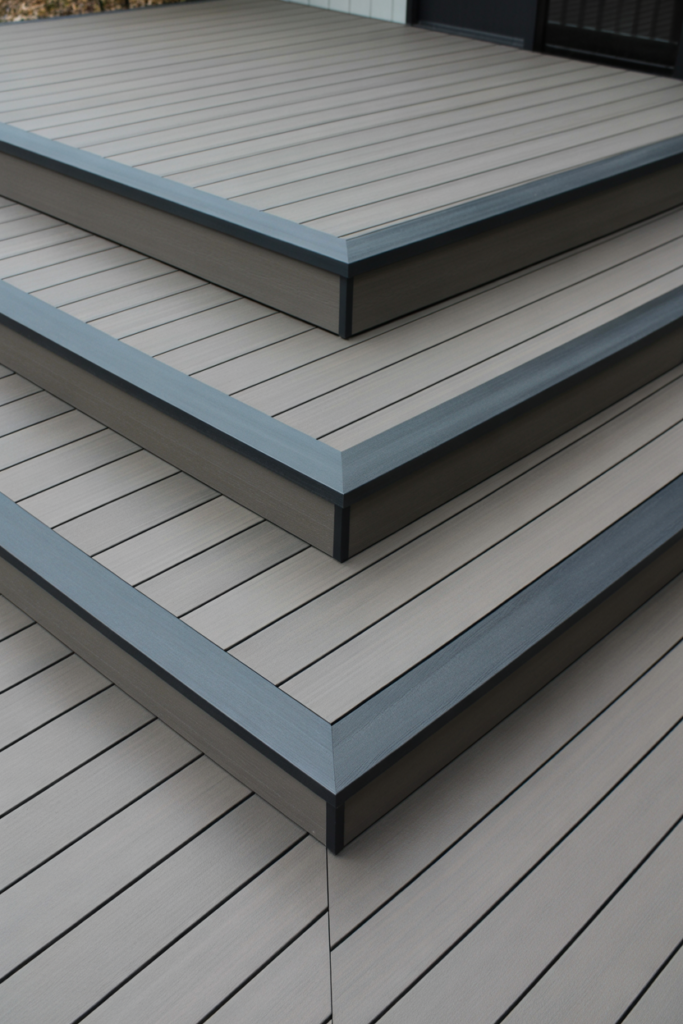
Sometimes, the best contrast is on the edges. I kept the entire top of the deck a uniform medium grey but used a very dark grey for the fascia boards—the boards that trim the outer edge of the deck.
This small detail creates a crisp, clean outline that makes the whole structure look sharp and well-defined. It’s a subtle but highly effective touch.
14. Diagonal Board Layout
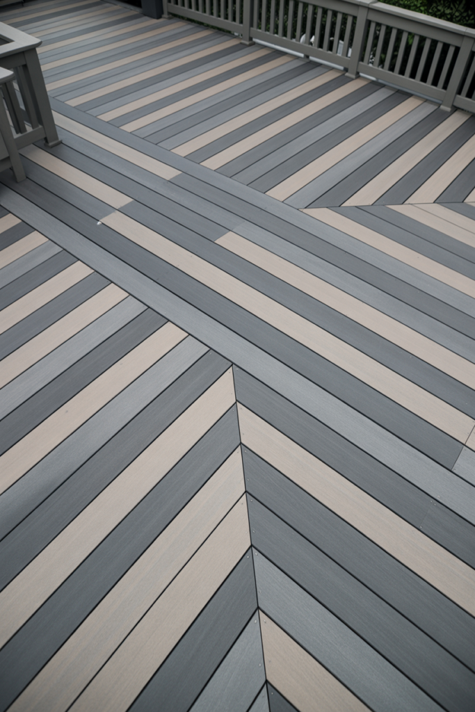
Instead of a standard horizontal layout, I laid the deck boards diagonally. I alternated between a light grey and a medium grey for a soft, striped effect that moved diagonally across the deck.
This layout is a fantastic way to make a standard rectangular deck feel more custom and dynamic. The diagonal lines draw the eye and can make the space feel larger.
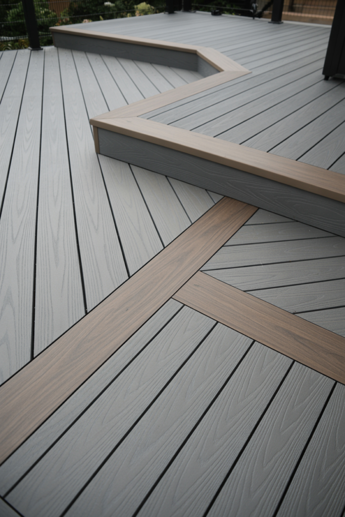
15. The Built-in Bench Contrast
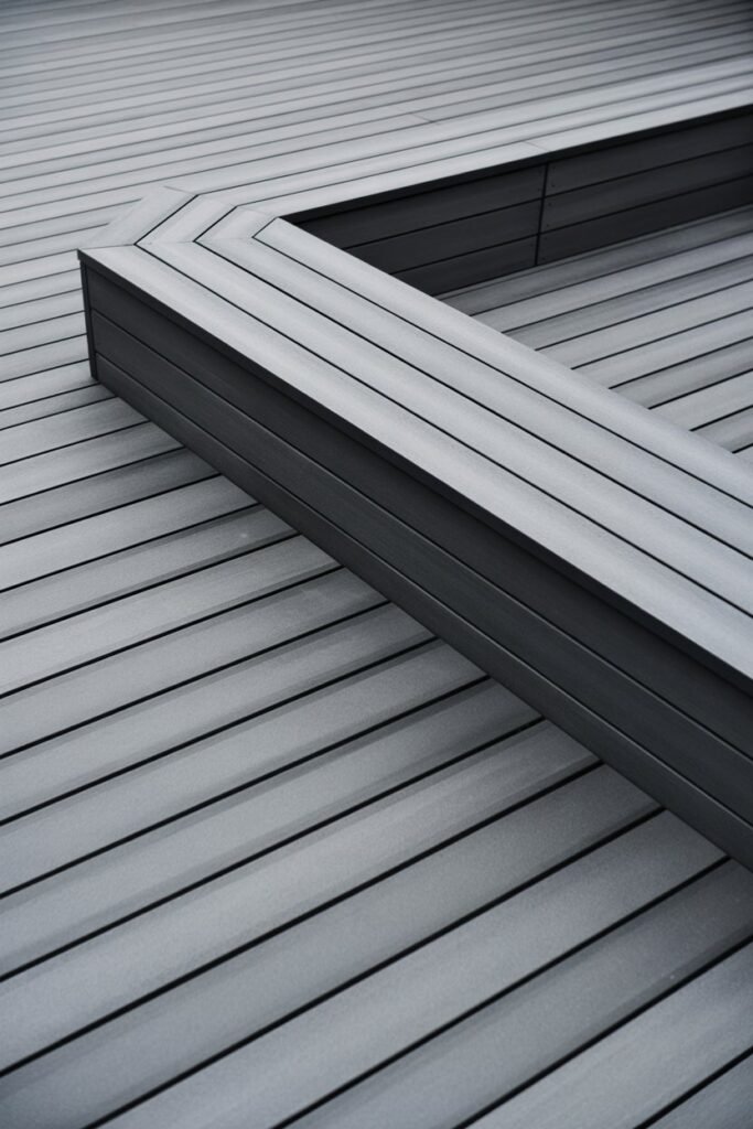
I have a built-in bench on my deck, and I used it as an opportunity for contrast. The deck itself is a light grey, but I built the bench using a dark charcoal grey composite.
This makes the bench a standout feature and integrates it beautifully into the overall design. It’s a functional and stylish way to apply the two-tone concept.
16. A Splash of Warm Grey
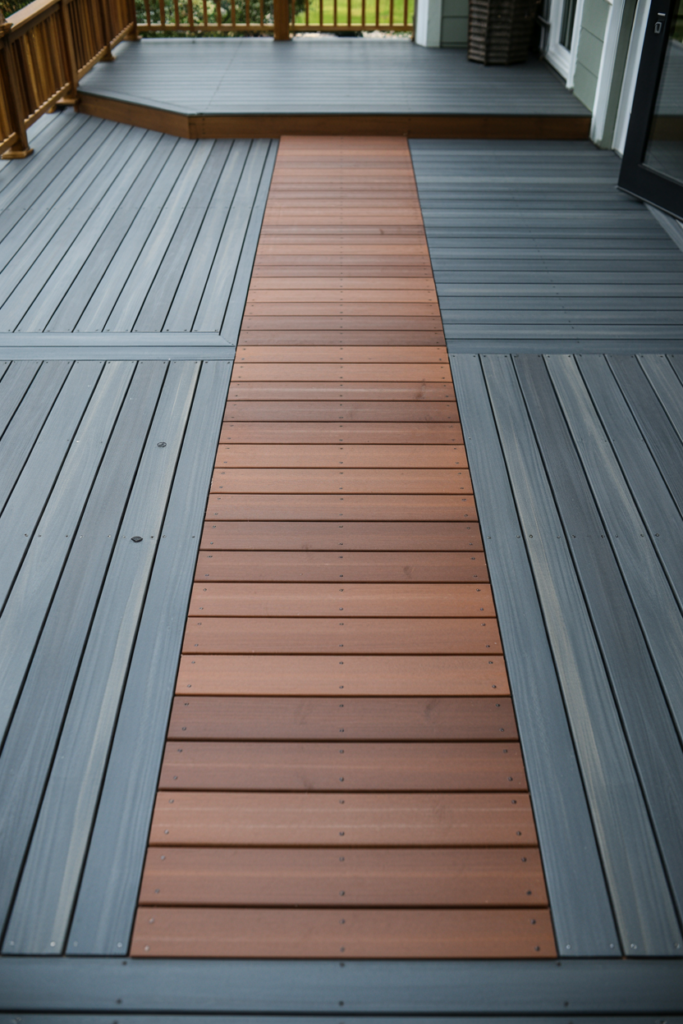
I broke up a large expanse of cool-toned slate grey by adding a section of warm, brownish-grey boards. I used this warmer tone to create a walkway or path leading to the back door.
This adds a touch of warmth and variation, preventing the deck from feeling too monotonous. It’s a great way to guide foot traffic and add visual interest.
17. Textured and Smooth Finishes
I explored using two grey composite boards with different textures. One had a deep, embossed wood grain in a dark grey, while the other had a smoother, brushed finish in a lighter grey.
The contrast in texture adds a tactile dimension to the deck. It feels interesting underfoot and creates a subtle visual pattern that changes with the light.
18. Perpendicular Accent Section
In the middle of my long, rectangular deck, I installed a small section of boards running perpendicular to the main layout. I used a darker grey for this accent section to make it pop.
This technique is great for breaking up a long, narrow deck and creating a visual “pause.” It’s an easy way to add a custom detail.
19. Grey Tones with Metal Accents
To enhance my two-tone grey deck, I chose railings with black aluminum balusters. The dark metal complements both the light and dark grey boards perfectly.
This combination creates a sleek, industrial-modern aesthetic that is very on-trend. The slim profile of the metal balusters also helps to keep the view open.
20. Understated Border
For a minimalist take, I used a border that was only slightly darker than the main deck boards. This creates a very subtle definition that adds a touch of refinement without being overt.
I find this works well for smaller decks, where a high-contrast border might feel too overwhelming. It’s a sophisticated and understated way to finish your deck design.
Conclusion
I hope these ideas have shown you just how versatile a grey two-tone deck can be. By playing with shades, placement, and texture, you can create an outdoor space that is uniquely yours.
If you’re ready to start designing, explore our range of composite decking materials to find the perfect grey pairing for your project.