20 Colors That Go with Red to Transform Your Space
Red is bold, energetic, and undeniably attention-grabbing. Whether I’m adding a crimson accent pillow or painting an entire wall scarlet, I know this powerful hue can completely transform a room. But here’s the thing—red works best when paired thoughtfully with complementary colors.
I’ve discovered that the right color combinations can either amplify red’s vibrancy or soften its intensity, depending on the mood I want to create.
In this guide, I’ll share 20 stunning colors that pair beautifully with red, along with practical tips for incorporating these combinations into your home.
1. Teal
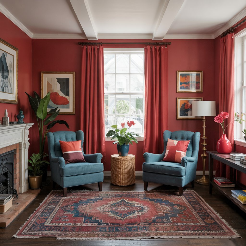
Teal and red create an unexpected yet striking contrast that I absolutely love. The cool, calming nature of teal balances red’s warmth perfectly.
I recommend using white as a neutral base to let both colors shine. Try placing teal armchairs in a living room with a red accent rug. The combination feels cozy yet sophisticated, and it’s particularly effective in spaces where you want energy without overwhelming the senses.
2. Pure White
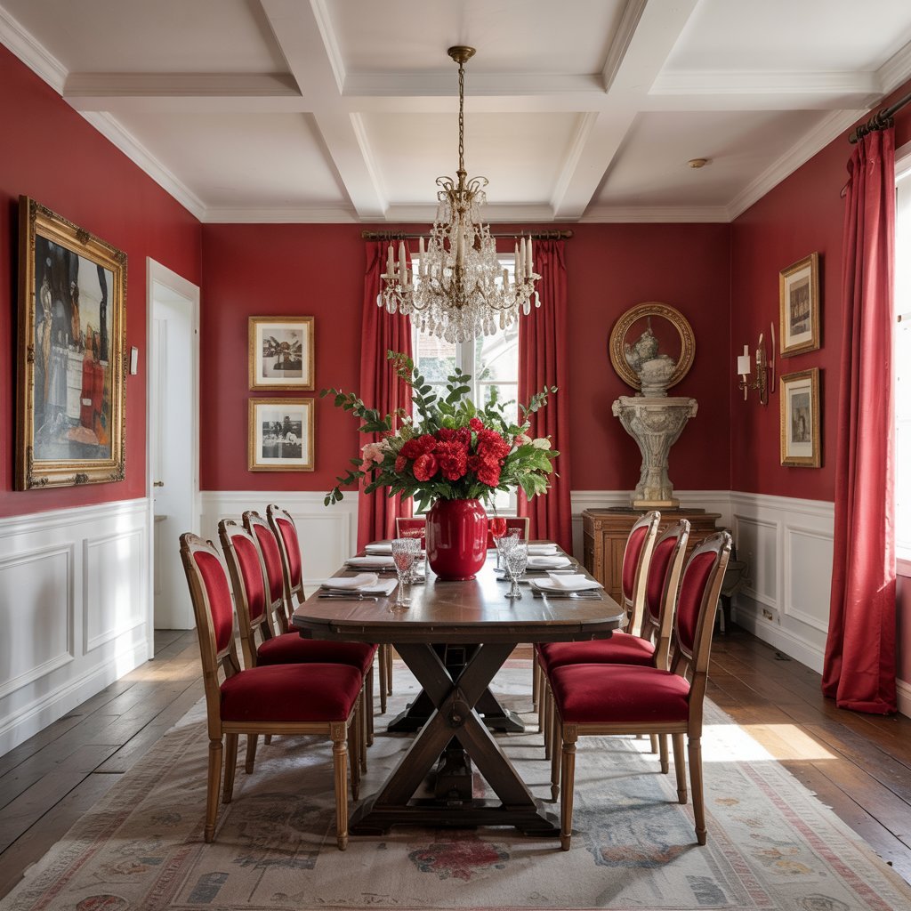
White is my go-to when I want red to be the star of the show. This classic pairing allows red to pop without competing for attention.
I often use white wainscoting or crown molding to temper bold crimson walls in dining rooms. The contrast creates visual interest while maintaining elegance. White also reflects light beautifully, making rooms feel larger and brighter even with intense red accents.
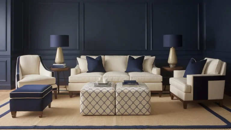
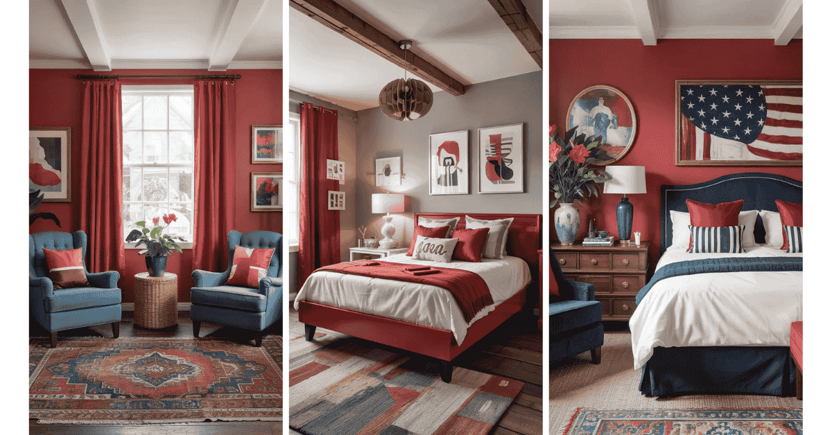
3. Navy Blue
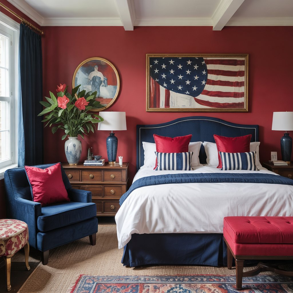
Navy and red form a timeless, patriotic palette that never goes out of style. I find this combination works exceptionally well in traditional and contemporary spaces alike.
Try pairing ruby red pillows with navy upholstery in a bedroom. The deep blue provides a grounding effect that prevents red from feeling too energetic for a sleeping space. According to color theory, these two primary colors naturally harmonize when balanced properly.
4. Turquoise
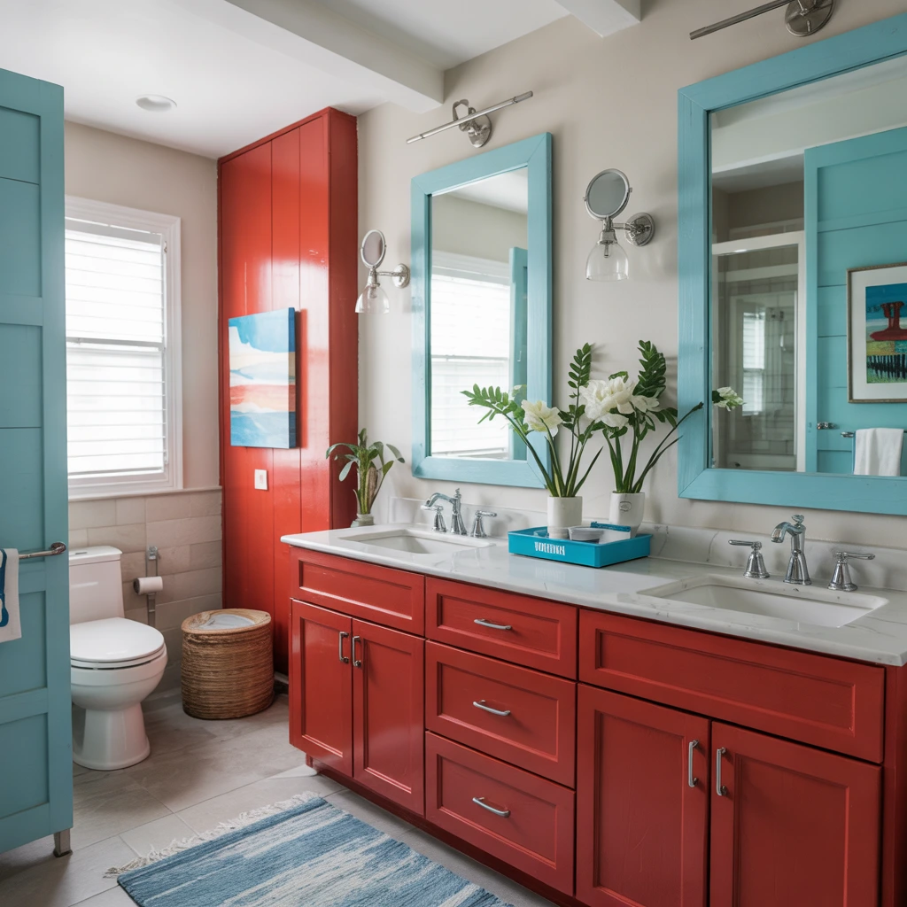
When I want to add a fresh, beachy vibe to a space, I pair red with turquoise. This combination feels modern and playful.
I’ve used bright red cabinetry with turquoise accents in bathrooms to create a contemporary coastal look. Large mirrors with light wood trim help lighten the overall aesthetic. Chrome fixtures tie everything together for a cohesive finish.
5. Dusty Rose
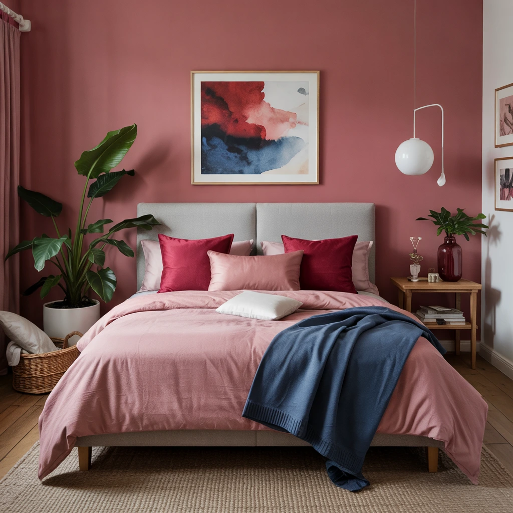
Dusty rose softens red’s intensity in the most beautiful way. I recommend this pairing for bedrooms where you want warmth without overwhelming energy.
Try ruby red pillows alongside dusty rose bedding and navy accents. The effect is inviting and restful rather than stimulating. This combination proves that red doesn’t have to be loud—it can be sophisticated and calming when paired thoughtfully.
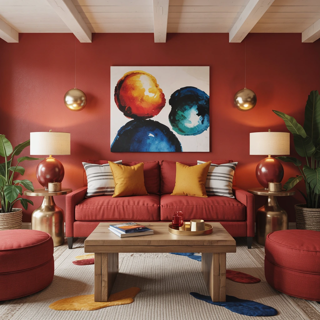
6. Pastel Yellow
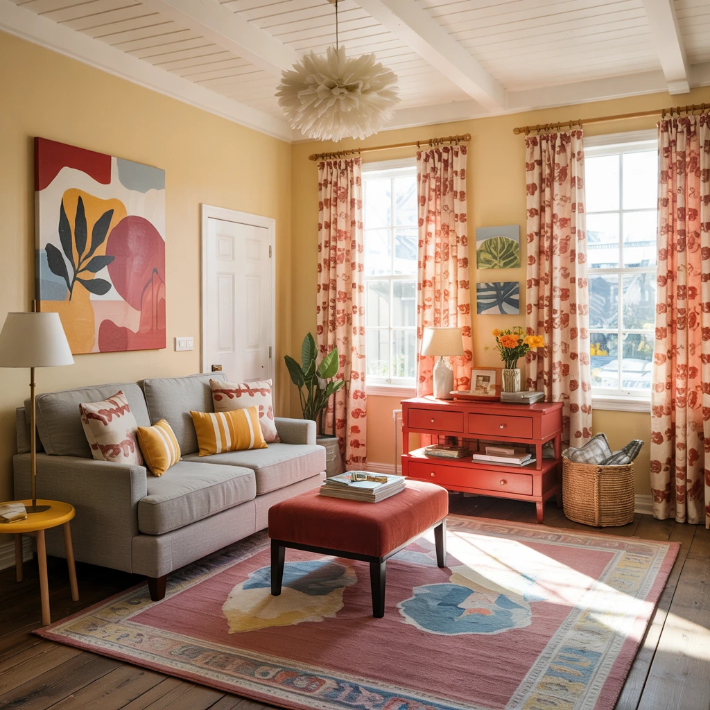
Pastel yellow brings sunshine into any red color scheme. I use this combination when I want a room to feel cheerful and energetic.
In high-ceiling spaces, I pair red-orange patterns on curtains and area rugs with pale yellow walls. The yellow prevents the red from feeling too heavy, while lavender accents add an extra layer of visual interest. This “more is more” approach works when you balance warm and cool tones carefully.
7. Slate Blue
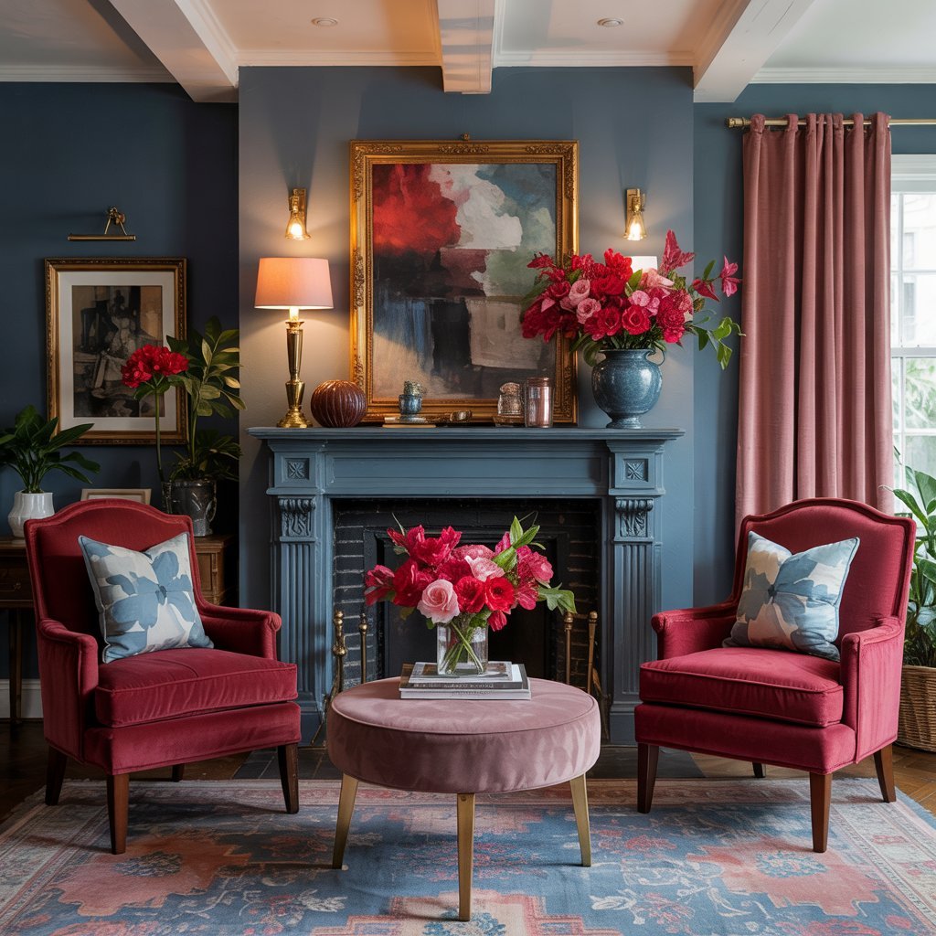
Slate blue is one of my favorite sophisticated partners for red. This cool-toned blue creates stunning contrast without competing.
I’ve painted fireplace walls in dark slate blue and added red velvet chairs for a dramatic living room focal point. Pink and red blooms on the mantel repeat the warm hues for balance. The combination feels both modern and timeless.
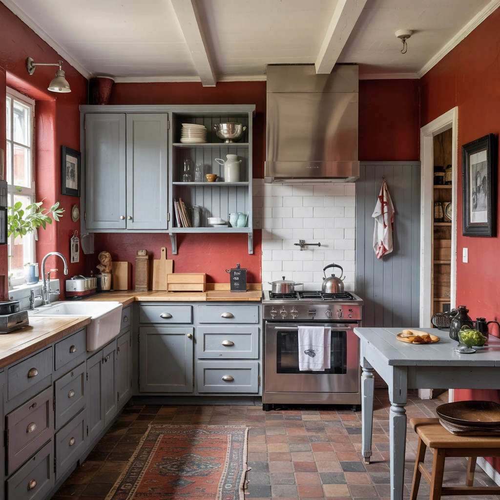
8. Industrial Gray
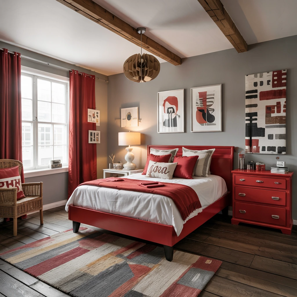
Gray provides the perfect neutral backdrop when I want red to make a bold statement. This combination works particularly well in contemporary and industrial spaces.
I recommend muted gray walls with crisp white trim to give red accents a grown-up look. In kids’ bedrooms, vintage-inspired red furniture against gray walls creates a timeless style that won’t feel dated as they grow older.
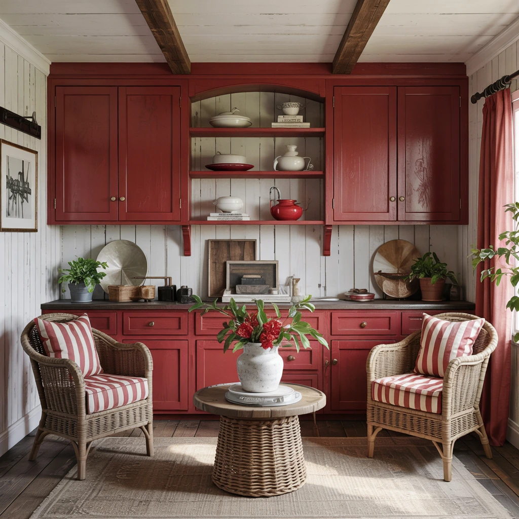
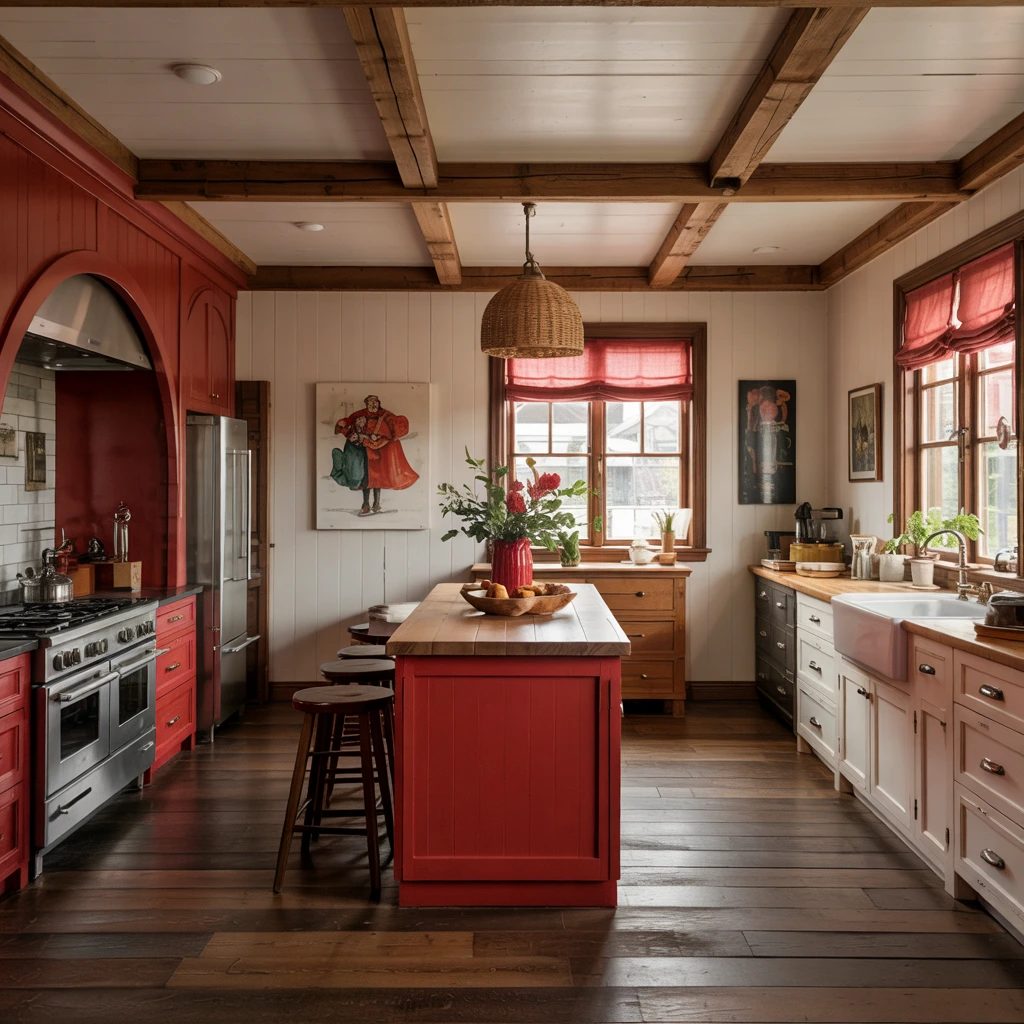
9. Creamy White
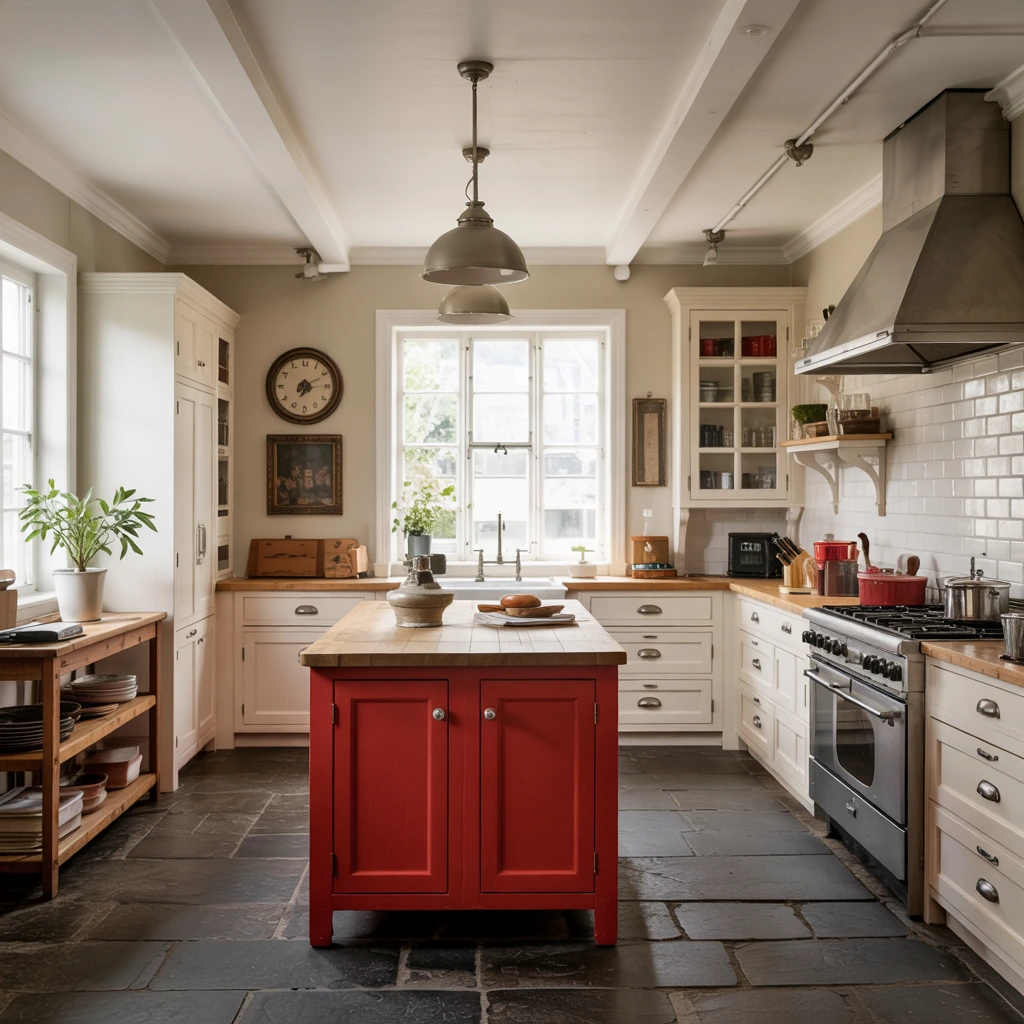
Creamy white offers a softer alternative to pure white. I use it when I want a rustic or farmhouse aesthetic.
A red kitchen island serves as a bold focal point against creamy white walls and vintage-style hardware. Dark floors recede into the background, keeping all attention on the cabinetry. Two pendant lamps above the island draw the eye exactly where I want it.
10. Golden Yellow
Golden yellow brings warmth and energy to red spaces. This combination of primary colors is backed by color theory and creates natural harmony.
I balance red ottomans, side tables, and accent pillows with blue walls and pops of golden yellow in throw pillows. All three colors work together because they share similar jewel-tone values. The result feels vibrant yet balanced.
11. Sisal and Natural Fibers
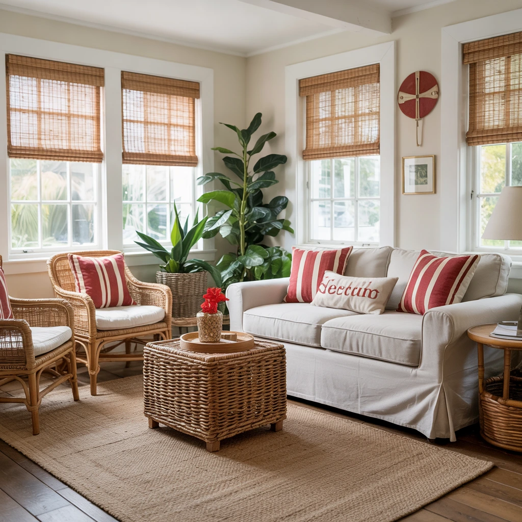
Natural sisal and woven textures provide the perfect neutral foundation for red accents. I love this combination for creating cozy, cottage-style spaces.
Red-striped pillows against slipcovers and woven furnishings like rattan chairs create a soothing atmosphere. The neutral backdrop allows red to pop without overwhelming the space. Matchstick blinds add another layer of natural texture.
12. Linen White
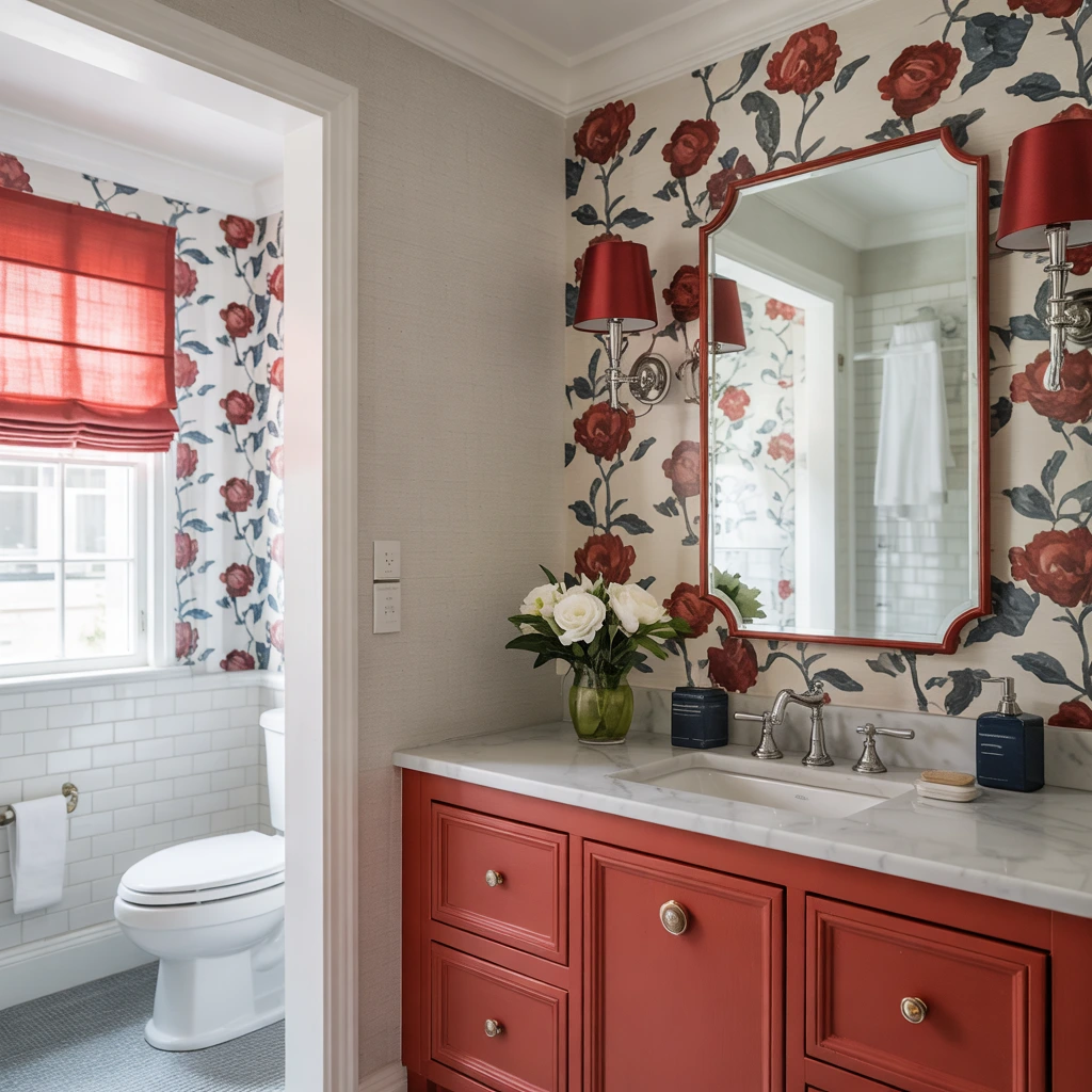
Linen white offers a timeless, slightly warmer alternative to stark white. I pair it with red and navy for a classic combination with contemporary flair.
Floral wallpaper featuring red and navy provides a modern twist in bathrooms when paired with marble-topped vanities. Wall sconces in vibrant red repeat the cabinetry color, while navy sink accessories tie the whole look together.
13. Black
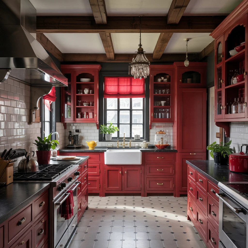
Black and red create high drama and sophisticated contrast. I use this bold pairing in kitchens and formal spaces.
Red-painted cabinetry with black-and-white tile flooring embodies classic character. Crystal cabinet hardware enhances the old-fashioned charm. For balance, I often add a third accent color like yellow to prevent the scheme from feeling too intense.
14. Stormy Gray
Stormy gray adds depth and modernity to red color schemes. I find this combination particularly effective in kitchens.
Terra-cotta red walls paired with gray painted cabinets and vintage tables create an inviting, hardworking kitchen. Black-framed artwork offers a soft contemporary element. The varying intensities of gray prevent the space from feeling flat.
15. Weathered White
Weathered white adds vintage charm when paired with red. I use this combination to create depth and visual interest.
Varying the intensity of red—like using bright red lower cabinets and dark maroon upper cabinets—adds character to built-in buffets. Weathered white walls prevent the multiple red shades from overwhelming the space. Red and white striped accents on rattan furniture enhance the vintage aesthetic.
16. Cerulean Blue
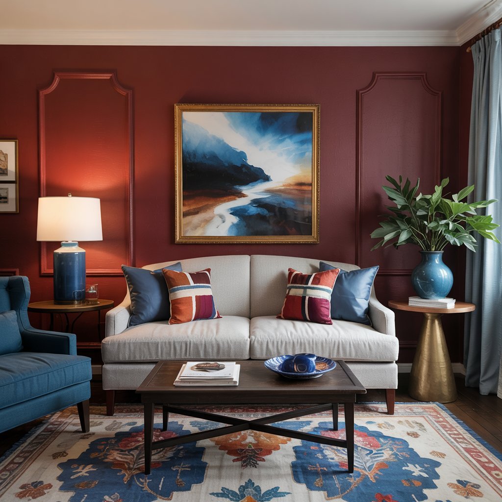
Cerulean blue is a sophisticated partner for deep burgundy reds. This combination works beautifully in fall and winter color schemes.
I pair oxblood red (a deep burgundy) with bright cerulean blue accents and a white sofa as a neutral focal point. The white brightens the scheme and prevents the rich, saturated colors from feeling too heavy. Research shows that thoughtfully designed color schemes can improve mood and reduce stress.
17. Spice Orange
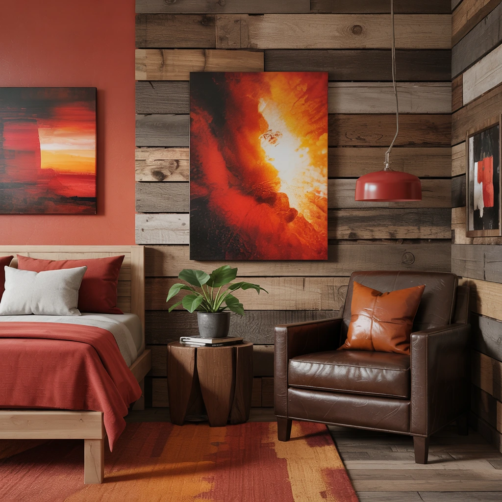
Orange and red are adjacent on the color wheel, making them natural companions. I use this combination for nature-inspired, contemporary settings.
Plank wood walls with red and orange artwork create a modern wooded hideaway feeling. A chocolate brown chair with caramel undertones maintains the cabin-like aesthetic. This earthy palette feels warm and grounding.
18. Aged Black
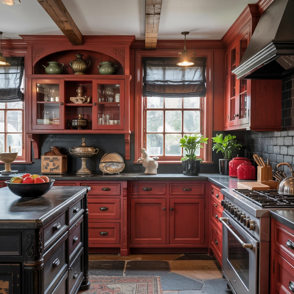
Aged black finishes add upscale, furniture-quality details to red color schemes. I recommend this combination for cottage-style kitchens.
Built-in hutches with coral red undertones flanked by black Roman shades create visual drama. Black stone surfaces and scrolled backsplashes complement the curves in red cabinetry. The layered, hand-rubbed finishes add depth and sophistication.
19. Ecru
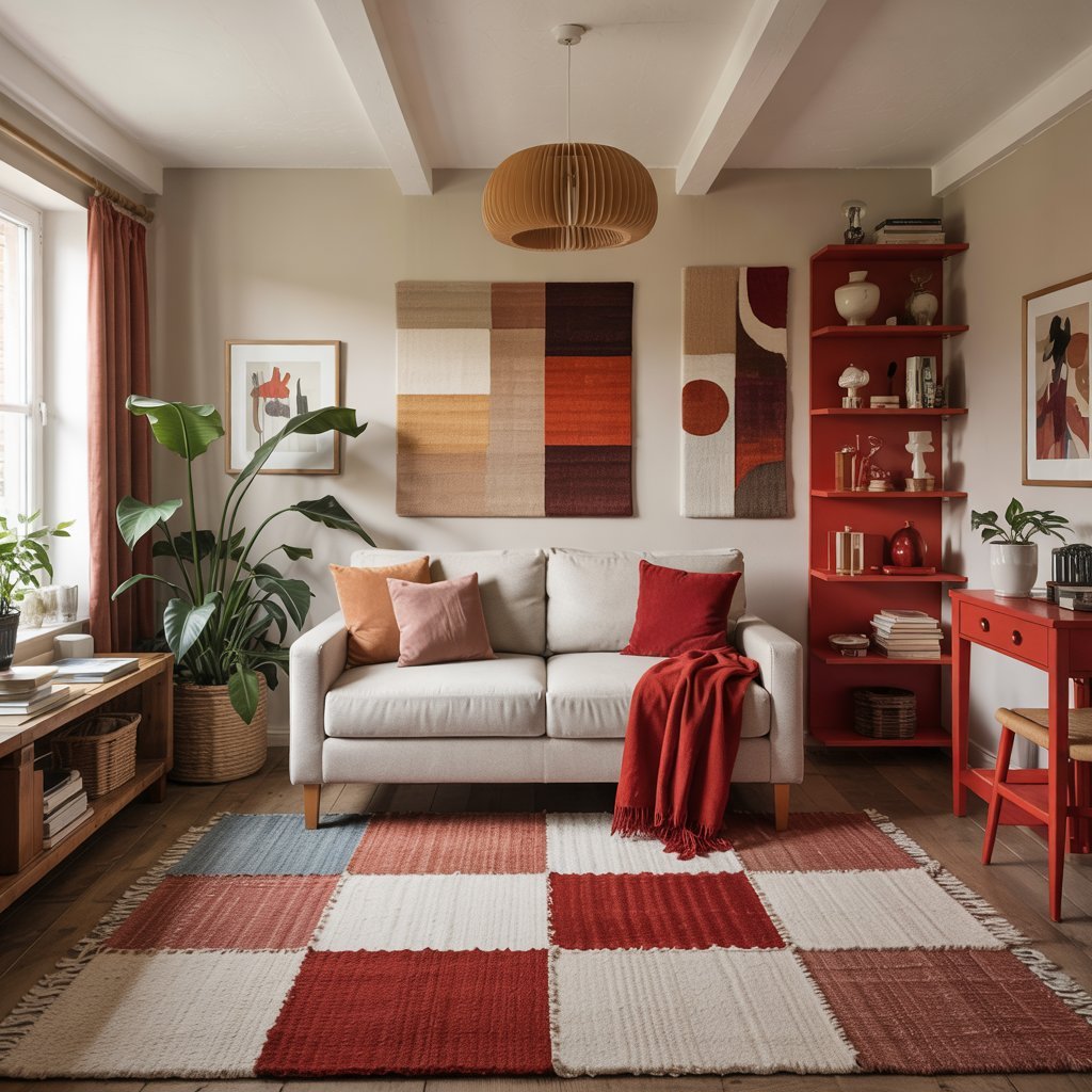
Ecru (a warm, creamy beige) creates cozy, inviting spaces when paired with various shades of red. I find this combination particularly effective in small rooms.
A range of earthy, faded reds in patchwork area rugs ground a space, while brighter red pops in side tables and bookshelves pull the eye around the room. Ecru wall paint, pendant lights, and upholstery all work together because they share warm undertones rather than cool ones.
20. Wood Tones
Natural wood tones provide the perfect neutral foundation for red accents. I use this combination to create warm, organic spaces.
Dark wood floors allow white cabinetry and red kitchen islands to shine without competing. Vintage-style hardware on red pieces enhances the warmth. Wood paneling on walls creates a cabin-like feel when combined with red and orange artwork.
Conclusion
Red is a powerful color that deserves thoughtful consideration. By pairing it with these complementary hues, you can create spaces that feel energetic yet balanced, bold yet sophisticated.
The key is understanding which mood you want to create and choosing partner colors accordingly. Whether you go all-in with red walls or add just a touch through accessories, these 20 color combinations will help you transform your space with confidence and style