16 Colors That Go With Pink in Home Decor to Brighten Your Space
Pink is such a fun color to work with in home decor because it can fit a lot of different styles. Whether you’re going for something soft and subtle or bright and bold, pink offers plenty of room to play.
I’ve found that pairing it with the right colors can really change the whole vibe of a room.
I want to share 16 colors that go with pink so you can find the perfect match for your space. These combinations can help you create anything from a cozy, calm atmosphere to a lively, energetic look. It’s all about mixing and matching what feels right for your home.
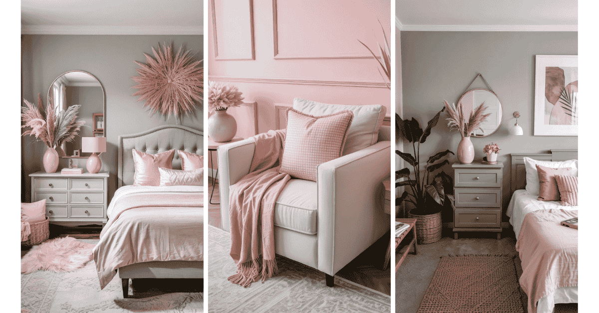
1) Soft Gray
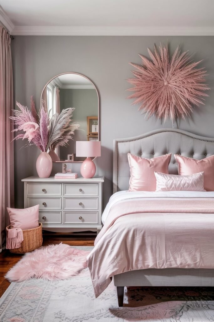
Soft gray is one of my favorite colors to pair with pink. It creates a calm and cozy vibe without overpowering the space. Pink pops gently against gray, making the room feel balanced and inviting.
I like using soft gray as a base color for walls or larger furniture pieces. Then, I add pink accents like pillows, throws, or small decor items. It keeps things modern but still warm.
This combo works great whether you’re going for a subtle look or want a bit of contrast. Plus, it’s super versatile for bedrooms, living rooms, or even a chic office space.
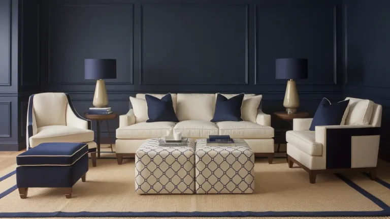
2) Navy Blue
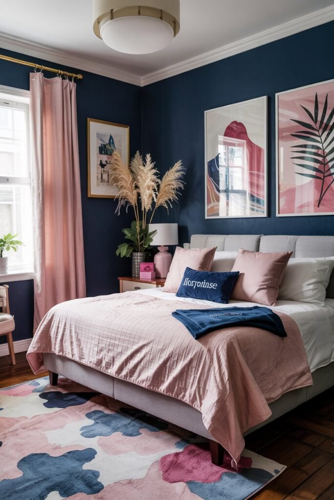
I really like how navy blue pairs with pink in home decor. The deep, calming tone of navy balances the brightness and cheerfulness of pink, making the combination feel both elegant and approachable.
In my experience, navy blue can ground a space without making it feel heavy. I’ve found that adding pink accents, like pillows or art, brings warmth and a playful touch to the room.
If you want a bold yet timeless look, navy and pink work great together. It’s a combo that allows for mixing different shades—soft blush with dark navy or bright pink with muted blue—depending on the vibe you’re going for.
3) Sage Green
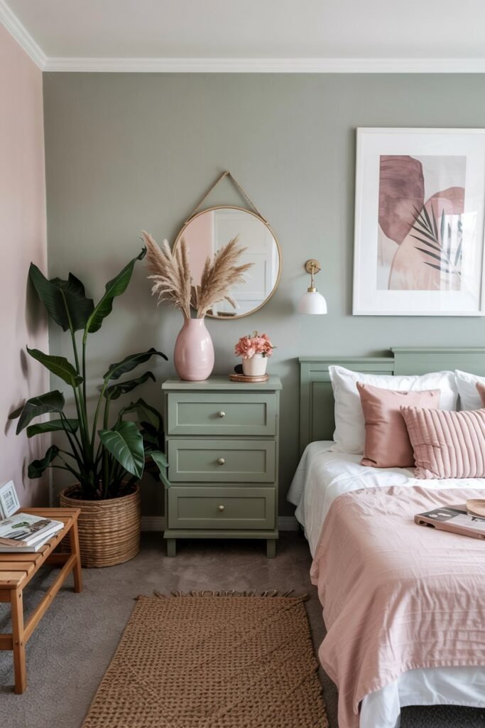
I’ve found that sage green pairs really well with pink, especially softer shades like blush. The two colors together create a calm and fresh vibe that feels both cozy and stylish.
In my experience, using sage green on walls or furniture with pink accents like pillows or throws can make a space look inviting without being too bold. Adding natural textures like wood or linen helps balance the look even more.
Sage green and pink are great if you want a subtle color combo that still feels interesting. It’s a go-to choice for bedrooms or living rooms where I want a relaxed but cheerful atmosphere.
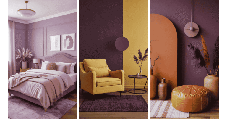
4) Mustard Yellow
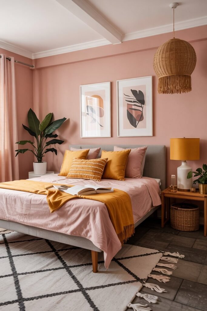
I love how mustard yellow adds a warm, earthy vibe when paired with pink. It’s not your typical bright yellow—it’s deeper and richer, which makes pink feel a bit more grown-up and sophisticated.
When I use mustard yellow in my space, it often comes in accents like cushions, lamps, or rugs. It has this cool way of making pink pop without overwhelming the room.
The combo feels cozy but still modern to me. It’s great if you want a splash of color that’s bold but balanced, especially with softer or muted pinks.
5) Crisp White
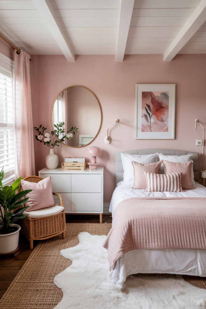
I like how crisp white pairs with pink because it keeps things fresh and clean. White tones down the brightness of pink without making the space feel dull. It creates a nice balance that feels calm and inviting.
Using white in bedding, walls, or furniture helps pink stand out without overwhelming the room. It’s a simple way to make the pink accents pop while keeping the overall vibe peaceful.
When I want a look that’s both bold and subtle, adding crisp white to pink works every time. It’s easy to mix in and makes the decor feel modern and timeless.
6) Warm Beige
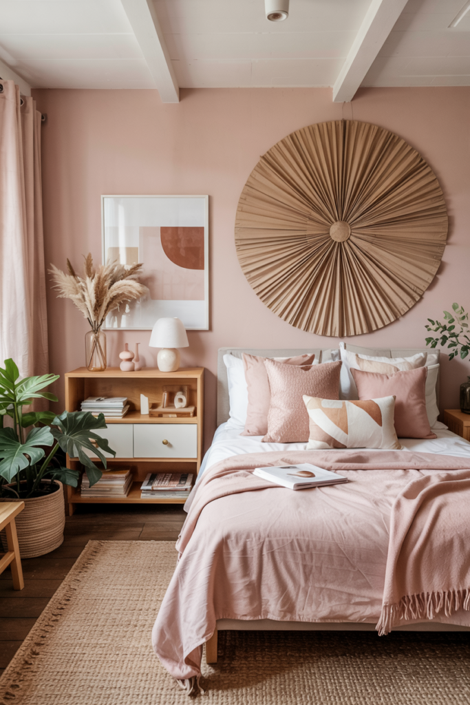
I really like using warm beige with pink because it creates a cozy, inviting vibe. The softness of beige tones down the brightness of pink, making the space feel calm but still cheerful.
Warm beige works great in rooms where you want comfort without losing style. It pairs well with both soft blush pinks and deeper, richer pinks.
To me, this combo feels balanced. Beige adds a lived-in warmth that keeps pink from feeling too bold or overwhelming. It’s a simple way to make any room feel more approachable.
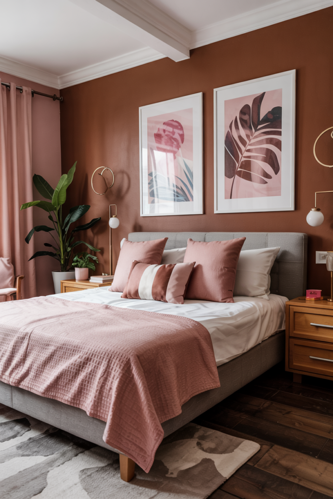
7) Charcoal Black
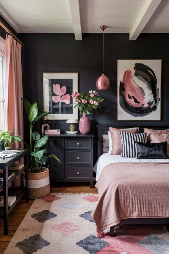
I love using charcoal black with pink because it creates a striking contrast without being too harsh. The deep, smoky tone of charcoal softens the boldness of pink, making the combination feel balanced and modern.
Charcoal black works great as a background color, letting pink accents really pop. I often use it on furniture or walls while adding in pink through pillows, artwork, or rugs.
This pairing feels both cozy and stylish. It’s perfect if you want a look that’s bold but also warm and inviting. Plus, charcoal black is versatile enough to match different shades of pink, from blush to fuchsia.
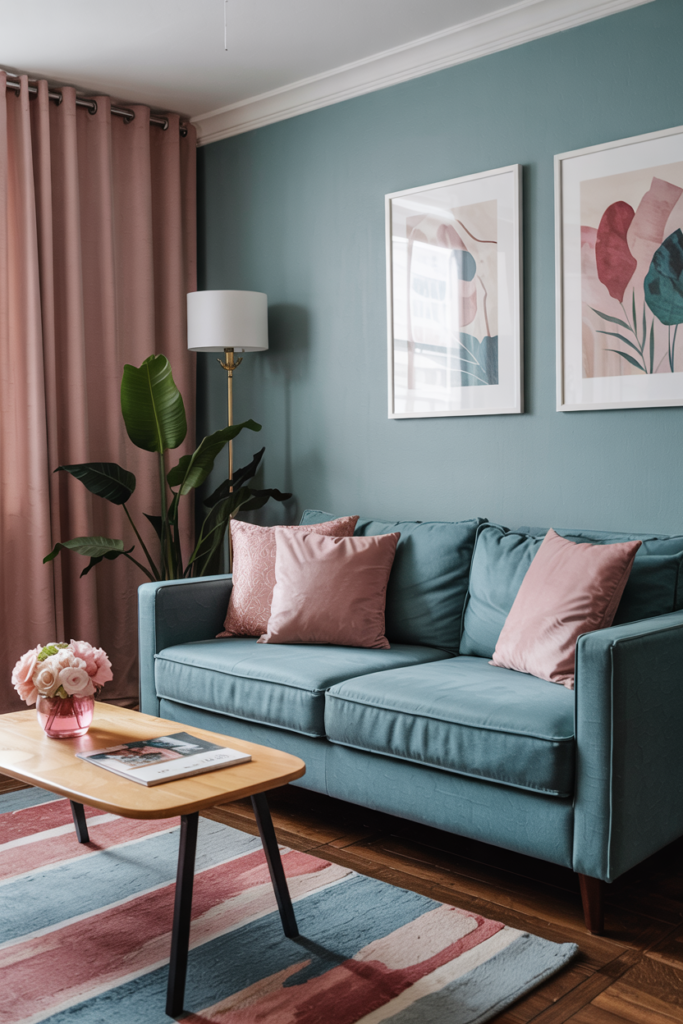
8) Dusty Blue
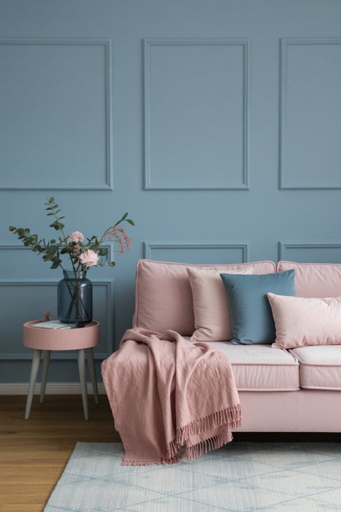
Dusty blue is one of my favorite colors to pair with pink. It’s soft and calming, which balances the warmth and brightness pink brings to a room.
I like how dusty blue gives a touch of elegance without feeling too formal. It works great in living rooms and bedrooms where you want a relaxed but stylish vibe.
The combination feels gentle and romantic to me, especially with blush or light pink tones. It’s not overpowering and keeps spaces feeling airy and fresh.
9) Lavender Purple
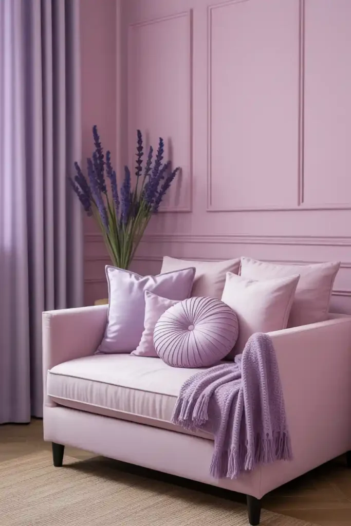
Lavender purple is one of my favorite colors to pair with pink. It’s soft and calming, which balances pink’s energy without overpowering it. The mix creates a gentle, inviting vibe in any room.
I like using lavender as accents like pillows or curtains alongside pink walls or furniture. It adds a subtle contrast that keeps the space fresh and not too sweet.
This color combo works well with neutrals, too. Adding beige or creamy whites can make the pink and lavender feel more sophisticated and less playful. It’s a nice way to keep things timeless while still being fun.
10) Burnt Orange
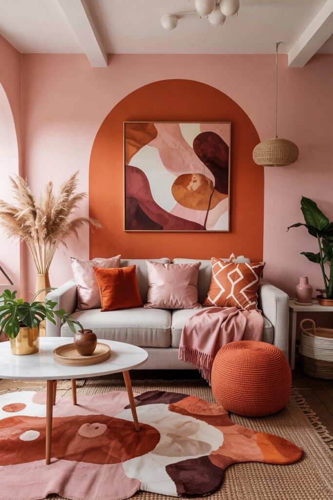
I find burnt orange to be an unexpectedly great match with pink. The warm, earthy tones of burnt orange balance out the softness of pink in a way that feels cozy and inviting.
Using burnt orange with pink can create a space that’s both bold and stylish without being overwhelming. I like to pair these colors in cushions or rugs to add depth and warmth.
This combo works well in living rooms where you want a mix of energy and comfort. Adding neutral elements like beige or cream helps keep the look grounded and easy on the eyes.
11) Gold Accents
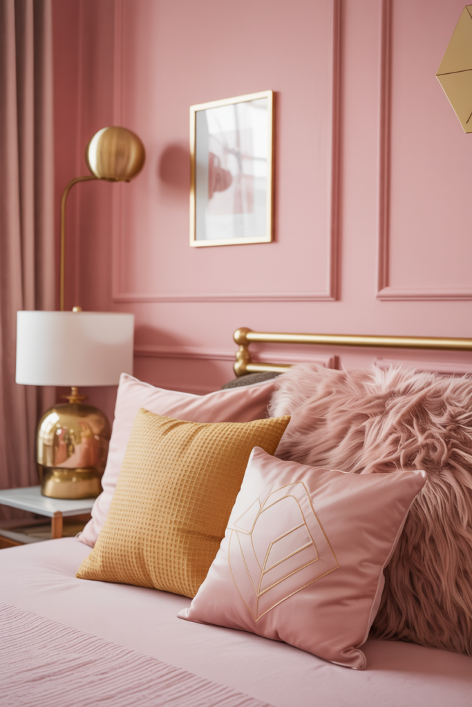
I love using gold accents when working with pink in home decor. Gold adds warmth and a bit of shine that instantly elevates the space without feeling over the top.
Throw pillows, lamps, or picture frames in gold are easy ways to bring this combo to life. It works with both soft blush tones and brighter pinks, giving a rich, elegant touch.
Metallic fixtures or small decor pieces in gold create that subtle glam vibe I often go for. It’s a simple trick to make pink feel a little more sophisticated and cozy at the same time.
12) Chocolate Brown
I really like how chocolate brown adds depth when paired with pink. The rich, warm tone of chocolate brown creates a nice contrast with both soft and bright pinks. It feels cozy and grounded without overwhelming the space.
If you have chocolate brown furniture or accents, pink can brighten things up and bring a fresh vibe. It’s an easy way to modernize a room without tossing out classic pieces.
Using pink pillows, throws, or wall art against chocolate brown creates a balanced look. It feels inviting but still stylish, which is exactly what I aim for in my own home.
13) Teal
I really like how teal and pink work together in home decor. Teal, being a mix of blue and green, adds a calming and cool vibe that balances the warmth and softness of pink. Using teal on larger elements like walls or sofas, with pink accents like pillows or artwork, creates a nice contrast without feeling overpowering.
When I pair these two, I tend to stick with muted or dusty pinks rather than super bright ones. This keeps the space feeling fresh and inviting. The combination feels modern but still has a cozy, approachable feel.
Teal’s versatility means it can match well with different shades of pink, whether it’s rose gold or a softer blush. It makes your space look thoughtful but not too matchy-matchy.
14) Olive Green
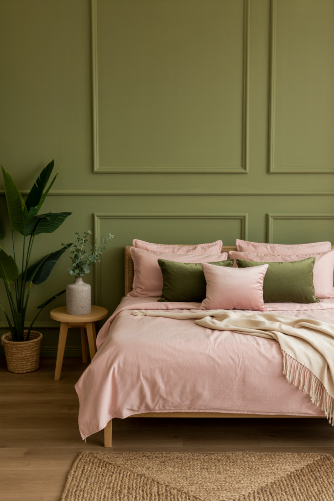
I find olive green pairs surprisingly well with pink in home decor. The earthy tone of olive balances out the softness of pink, creating a cozy yet fresh look.
When I add blush pink accents like pillows or throws against olive walls or furniture, it feels calm and inviting. The combo works great for bedrooms or living rooms where I want a relaxed but stylish vibe.
Olive green’s natural, grounding feeling contrasts nicely with pink’s romantic touch. It’s a mix that feels both modern and timeless without being too loud or busy.
15) Creamy Ivory
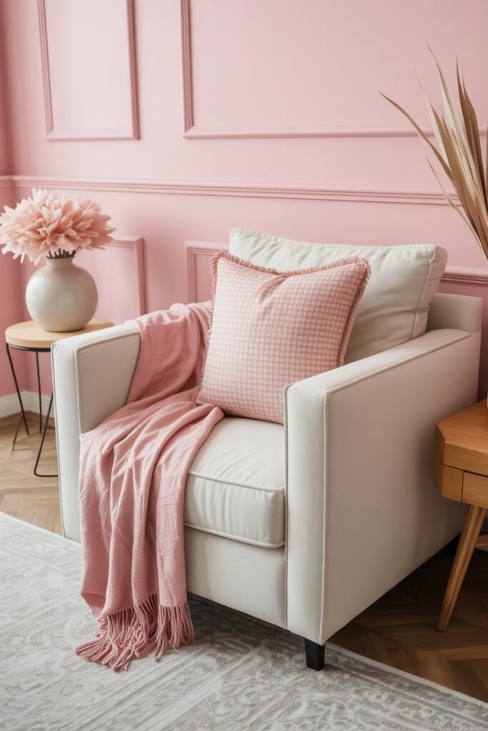
I love how creamy ivory adds a soft, calming touch when paired with pink. It’s subtle enough to let pink shine, but also warms up the space without overpowering it.
Using creamy ivory with pink creates a fresh and inviting vibe. It makes rooms feel bright, yet cozy—perfect for living rooms or bedrooms where you want a relaxed mood.
I find that adding some metallic accents or light pastels with this combo adds a bit of elegance. It’s a simple way to keep things stylish without going too bold.
16) Coral
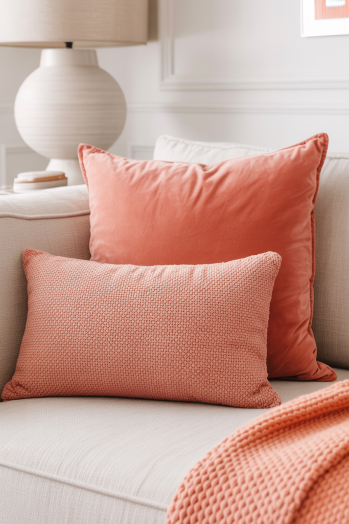
I love using coral alongside pink because it creates a warm and inviting vibe. Coral mixes shades of pink and orange, which gives it a lively but soft feel that works well in any room.
When I add coral accents like cushions or throws, it instantly brightens up the space without clashing. It’s a great way to bring energy without going overboard.
Coral pairs well with neutral colors, making it easy to blend into existing decor. For me, it’s the perfect choice if I want a fresh pop of color that still feels cozy and stylish.
How Pink Interacts With Different Colors
Pink works differently depending on the color’s warmth and the textures you mix with it. Its look changes whether paired with cooler or warmer tones, and adding texture can either soften or amplify the color’s impact.
Understanding Color Temperature
Pink can feel warm or cool depending on its shade. Warmer pinks like coral or salmon bring energy and friendliness to a room. They pair nicely with colors such as ochre, beige, or gold for a lively but balanced look.
Cooler pinks, like mauve or blush, offer calmness and pair well with blues and purples. For example, sky blue with a soft pink creates a soothing vibe, while magenta can add punch when combined with turquoise.
I like to think about the atmosphere I want when picking pink’s color partners. Warmer combos tend to wake up a space, and cooler tones help it relax.
Combining Textures With Color
Texture changes how we experience pink. A matte pink wall feels different than pink velvet cushions or glossy pink tiles. Soft textures—like plush fabrics or velvet—make warmer pinks feel cozy and inviting.
Glossy or reflective surfaces bring out the brighter side of pink, giving it energy and making it pop. Rough or natural textures like wood or woven fibers can help balance an intense pink by grounding it.
When I decorate, I layer textures to add depth and interest. Mixing pink with soft and natural materials can make the color more versatile and less overwhelming. It’s all about how tactile elements work with your color choices to create mood.
Tips For Styling With Pink And Other Colors
Using pink with other colors can feel tricky, but it’s all about balance and layering. Whether you want a bold statement or something soft and cozy, the way you mix pink with different elements in a room makes a huge difference.
Accent Walls And Furniture
When I want pink to stand out, I often pick an accent wall or a piece of furniture in a contrasting or complementary color. For example, a soft blush pink wall paired with navy blue or emerald green furniture creates a rich, sophisticated vibe. Darker hues like these really anchor the space and prevent the pink from feeling too sweet or overwhelming.
If you prefer something more subtle, a pale pink wall with white or beige furniture keeps things airy and bright. The key is to let either the wall or the furniture pop, but not both. Too much pink everywhere can feel unbalanced.
Layering Accessories For Depth
Accessories are my favorite way to bring pink and other colors together without committing to big changes. I layer throw pillows, rugs, lamps, or artwork in shades like mustard yellow, brass, or sage green to add depth.
Using metallic accents like gold or brass with pink warms up the space instantly. I also like mixing textures—velvet pillows, woven baskets, and smooth ceramics—to make the colors stand out more and feel inviting.
A simple tip: use a color wheel as a guide for mixing tones that really work and avoid clashing.