

20 Best Living Room Paint Colors for a Stylish & Cozy Space
Your living room is more than just a place to sit – it’s where memories are made, stories are shared, and personalities shine. Choosing the right paint color for this space is one of the most impactful ways to set the tone for your home.
Whether you’re revamping your style or simply freshening up the walls, the perfect color can transform your living space into a cozy, inviting retreat or a bold statement room.
This article will guide you through the effects of color on mood, present twenty inspiring paint ideas for your living room, and provide practical tips for making the best choice.
How Colors Affect Mood in a Living Room
Before you select a paint color, it’s essential to understand the role color plays in shaping the mood and perception of a room.
- Warm Colors (Reds, Oranges, Yellows): These hues create a sense of energy and warmth, ideal for lively spaces. They can make your living room feel brighter and more inviting.
- Cool Colors (Blues, Greens, Purples): Perfect for calm and relaxation, these colors are soothing and great for creating a serene atmosphere.
- Neutral Tones (Whites, Grays, Beiges): Neutrals provide timeless elegance and versatility, creating a blank canvas that accommodates various design styles.
- Bold Colors (Blacks, Deep Reds, Teals): These make a striking impression, adding depth and drama to your living space while emphasizing particular design elements.
Understanding the effects of color will help you choose the one that aligns best with your desired living room atmosphere.
20 living room paint colors
1. Neutral Beige

Beige tones like Brandon Beige offer a soft, warm foundation that creates a welcoming and relaxed atmosphere. This versatile shade works seamlessly with any style of furniture or décor, from modern minimalist to rustic charm, making it an excellent choice for those who love to switch up their interior design frequently.
Neutral beige also has the added benefit of reflecting light beautifully, making smaller living rooms feel more open and airy. It’s a timeless option that never goes out of style.
2. Navy Blue
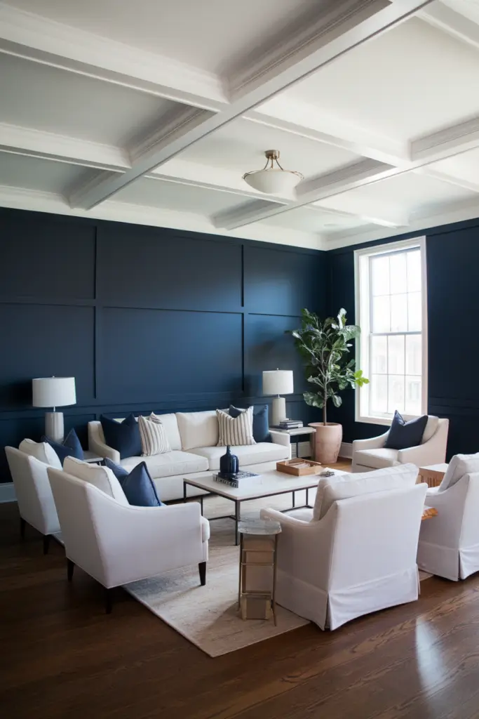
For a bold yet sophisticated look, try a shade like Hague Blue. Navy blues bring a sense of depth and luxury to a living room, creating a cozy and dramatic ambiance without feeling overpowering. Pair it with lighter furniture or metallic accents for a balanced and stylish contrast.
Navy blue also works wonderfully with warm wood tones and brass finishes, adding an extra layer of richness to your space. Whether you’re designing a traditional or modern room, navy blue adds a touch of elegance and refinement.
3. Crisp White

A classic option, Simply White, instantly brightens and expands a living room, making it feel open and spacious. Its unparalleled versatility allows you to easily change up your décor over time, whether you’re going for a minimalist aesthetic or a more colorful, eclectic vibe.
Crisp white also acts as the perfect canvas for bold artwork or statement pieces, letting your personal style shine. It’s a timeless and reliable choice for any design style, ensuring your living room feels fresh and clean year-round.
4. Sage Green

Soft greens such as October Mist provide an earthy, organic feel that promotes relaxation and calm. Perfect for wellness-inspired or nature-themed homes, this shade pairs beautifully with natural wood tones, neutral fabrics, and even pops of floral patterns for a harmonious, grounded look.
Sage green is particularly effective for creating a seamless connection between indoor and outdoor spaces, making it a great choice for homes with lots of plants or large windows. Its soothing vibe makes it ideal for achieving a tranquil, balanced living room.
5. Light Gray

Timeless and understated, a shade like Classic Gray adds subtle sophistication to any living room without drawing too much attention to the walls.
Its neutral tone provides an excellent backdrop for bold accent colors, statement furniture, or layered textures, making it a favorite for modern and transitional designs.
Light gray has the added benefit of being incredibly versatile, working well in both cool and warm color palettes. It’s a dependable option for creating a polished, elegant look that highlights your furnishings and décor.
6. Blush Pink

For a touch of elegance and warmth, consider Pink Ground, a soft pastel that exudes charm and sophistication. This delicate shade pairs wonderfully with gray furnishings, gold accents, or even jewel tones for a luxurious yet inviting living space.
It’s perfect for creating a cozy, feminine atmosphere without feeling overly sweet or childish.
Blush pink also works beautifully with textured fabrics like velvet or linen, adding depth and softness to your living room. Its gentle hue creates a comforting and nurturing environment.
7. Chocolate Brown
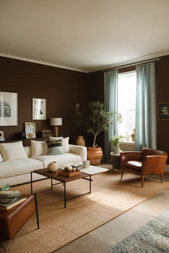
Rich and earthy, Hearthstone Brown brings an inviting warmth to living rooms, making it an ideal choice for rustic or vintage-inspired spaces.
This deep, grounding tone pairs beautifully with warm lighting, leather furniture, or natural textures like exposed wood and woven fabrics, creating a timeless, cozy ambiance.
Chocolate brown also works well in open-concept spaces, helping to define the living area while maintaining a cohesive look. It’s a great way to add depth and dimension to your room while keeping it grounded and sophisticated.
8. Sunny Yellow
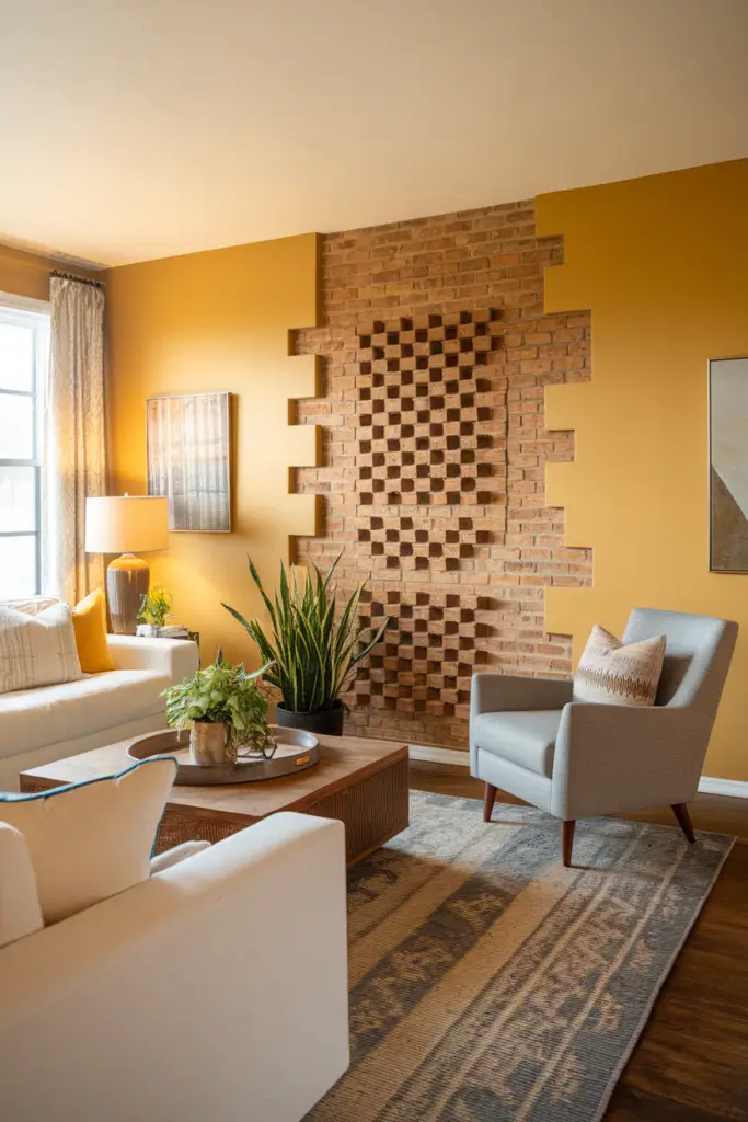
For a playful and cheerful living room, Dayroom Yellow adds energy and vibrancy to the space. This shade works well in rooms that get plenty of natural light, enhancing the brightness and creating a sunlit, happy vibe. Pair it with white trim or pastel accents for an uplifting, joyful look.
Sunny yellow can also be used sparingly as an accent wall, creating a focal point that draws the eye and energizes the space. It’s perfect for creating a fun, welcoming environment that feels full of life.
9. Deep Teal
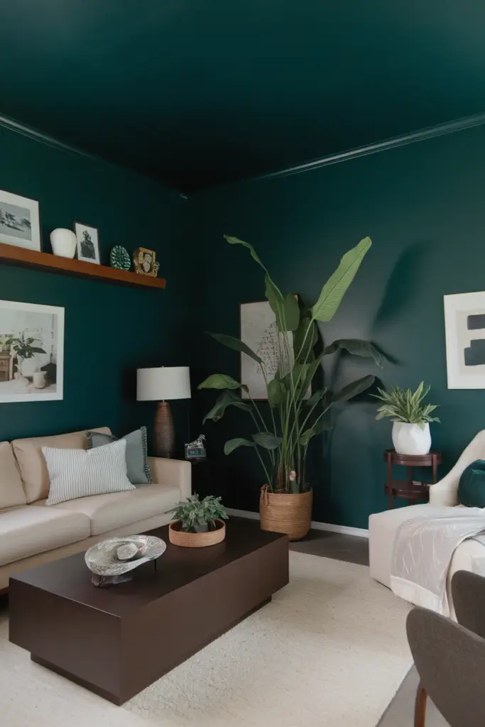
A shade like Gentleman’s Gray offers a unique, dramatic touch that’s both stylish and unexpected. This deep, rich teal pairs exceptionally well with gold accents, dark wooden furniture, or plush velvet textures, making it perfect for creating a luxurious and cozy retreat in your living room.
Deep teal also has the ability to make a space feel intimate and inviting, especially when paired with warm lighting. It’s an excellent choice for those who want a bold, statement-making color that still feels sophisticated and timeless.
10. Light Blue

Cool hues like Harbor Haze bring a blissful, airy feeling to any living room, reminiscent of clear skies and open spaces. This calming shade is perfect for coastal-inspired interiors or for adding a sense of tranquility. Pair it with white trim, natural textures, or soft pastel accents to enhance its serene charm.
Light blue also works well in spaces that need a touch of softness and brightness without overwhelming the senses. Its versatile, soothing quality makes it an excellent option for creating a peaceful sanctuary in your home.
11. Charcoal Gray
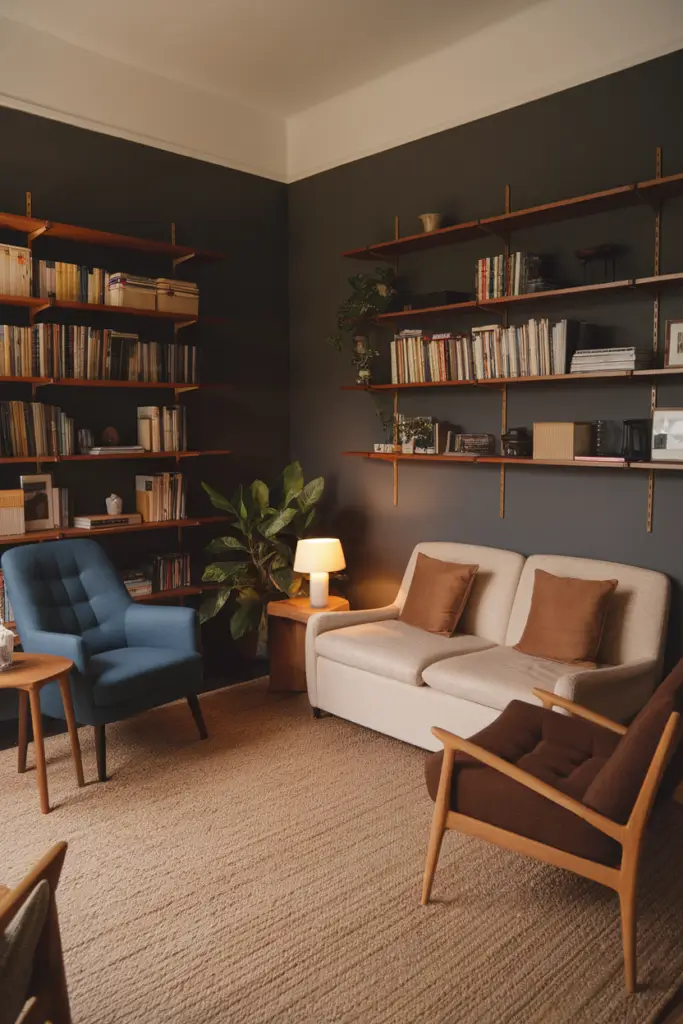
For understated drama, try Kendall Charcoal—a bold, versatile choice that pairs beautifully with crisp white trim and sleek, contemporary furniture. This rich gray tone creates a grounding effect, making it perfect for modern and minimalist living rooms that need a touch of depth and elegance.
Its neutral yet striking presence makes it a great backdrop for bold art pieces, metallic accents, or layered textures like wool rugs and velvet pillows.
12. Taupe
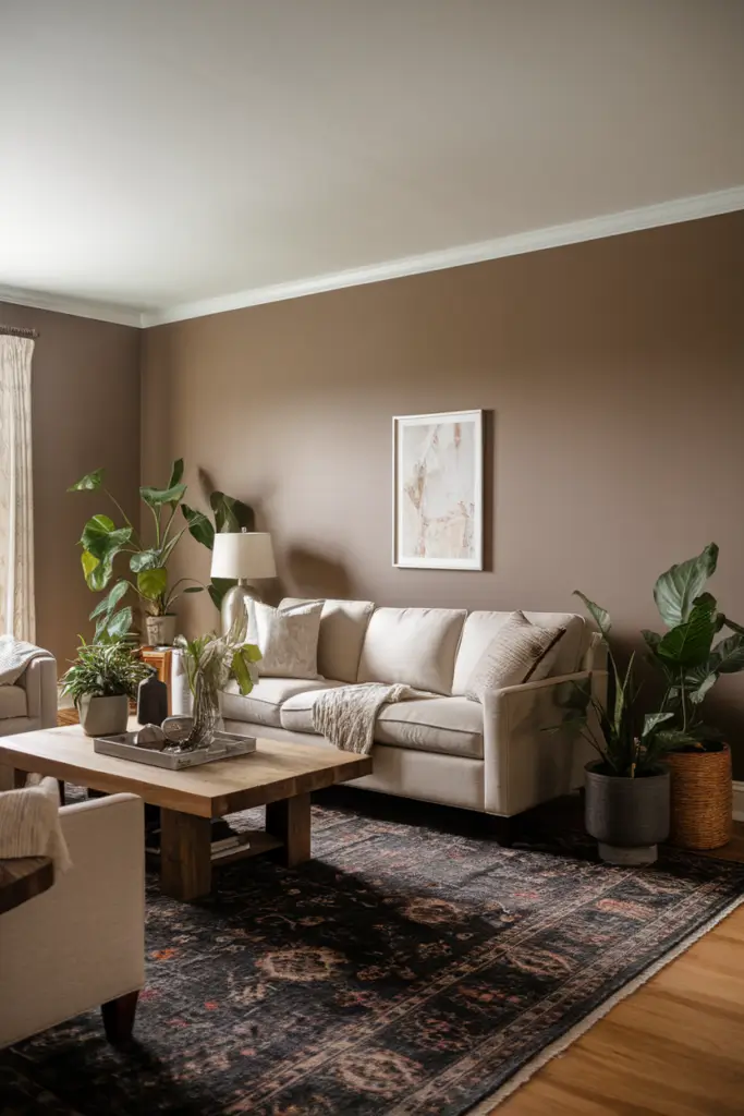
A soft and elegant neutral tone like Driftwood maintains a cozy yet sophisticated appearance. Its warm undertones make it a flexible option that pairs well with natural wood accents, soft textiles, and both modern or traditional furniture styles.
Taupe’s subtle versatility allows it to complement earthy tones or brighter pops of color, making it a go-to choice for those who want a timeless and inviting space.
13. Dusty Purple
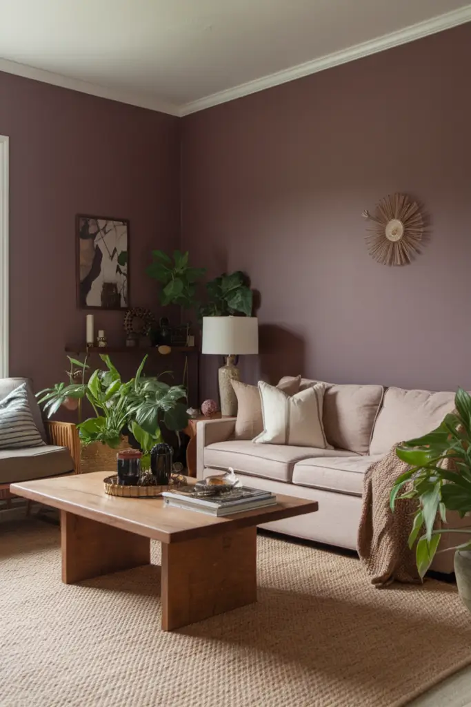
Soft purples, such as Winter Gray, add a luxurious yet relaxing vibe to your living room. This subtle hue works particularly well in spaces with ample natural light, creating a calming atmosphere while effortlessly complementing metallic accents, cream-colored furnishings, or soft textiles like velvet and linen.
Dusty purple adds just the right touch of personality to your room without overwhelming the space.
14. Vibrant Orange
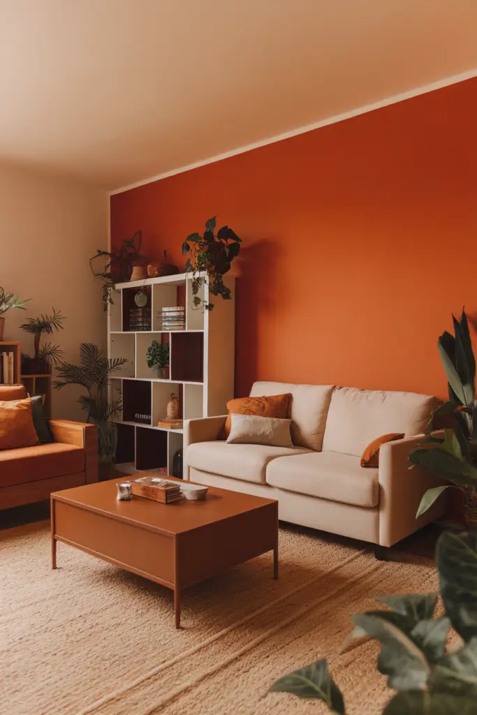
A bold choice, Burnt Russet, adds warmth and energy to your living room while complementing earthy tones like browns, beiges, and deep greens.
This vibrant hue is perfect for creating an inviting, cheerful space that feels dynamic and full of life. Whether used as an accent wall, in statement furniture, or through accessories like throw pillows, vibrant orange makes a bold statement while remaining cozy and grounded.
15. Greige

For those torn between beige and gray, Revere Pewter offers a balanced, modern touch that works in almost any setting. Its clean, neutral tone creates a sophisticated backdrop, blending seamlessly with various design styles, from rustic to contemporary.
Greige is particularly versatile, pairing effortlessly with pops of color, natural wood finishes, or sleek metallics, making it an ideal choice for those seeking a polished yet flexible canvas.
16. Black Accent Wall

Adding a dramatic, modern edge, shades like Black Beauty create depth and highlight your living room’s best features.
This bold choice works exceptionally well when paired with lighter walls, metallic fixtures, or vibrant artwork to create striking contrast and visual interest.
Black accent walls are perfect for grounding the space while maintaining an air of sophistication, especially in rooms with high ceilings or plenty of natural light.
17. Peach
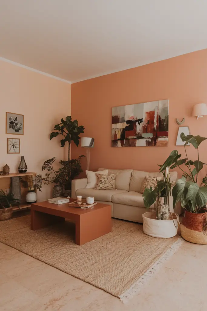
Fresh and youthful, Peach Parfait softens the space and brings a warm, welcoming glow to your living room. It pairs beautifully with gold or brass accents, soft pastel furniture, and natural textures like wicker or linen for a light, airy feel.
Peach tones are ideal for creating a cheerful, inviting atmosphere while maintaining a sense of elegance and charm, making it a favorite for family spaces or social areas.
18. Burgundy
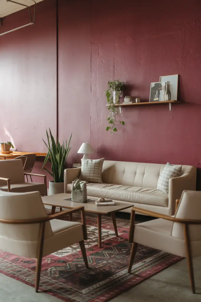
Elegant yet cozy, Brinjal brings warmth and richness to your living room, making it an ideal choice for entertaining areas. This deep and dramatic shade pairs well with soft lighting, plush upholstery, and metallic details to create a space that feels both glamorous and inviting.
Burgundy works wonderfully as an accent wall or throughout the entire room, adding a sense of depth and sophistication that’s perfect for formal or intimate settings.
19. Olive Green
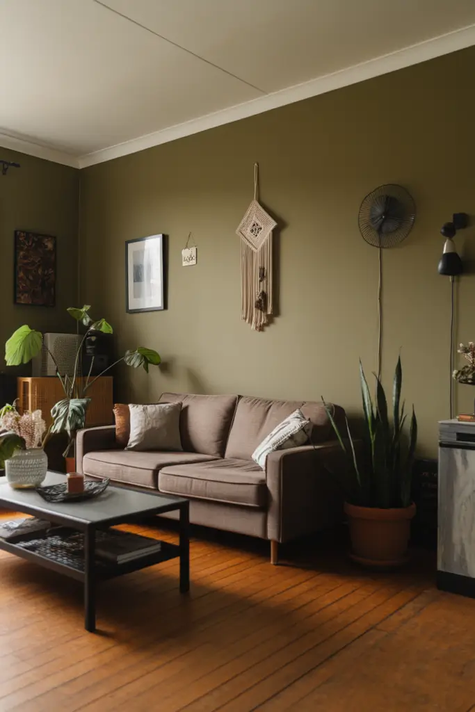
Earthy shades like Regent Green create a grounded, calming environment with a touch of sophistication.
This timeless color works well with neutral tones, warm wood finishes, and plenty of greenery to bring a natural, serene vibe to your living room.
Olive green is perfect for creating a cozy retreat-like atmosphere, especially when balanced with soft lighting, textured fabrics, or rustic decor elements.
20. Bright Coral

Adding a lively, tropical vibe, a shade like Raspberry Blush makes your living room unforgettable. Its bold and cheerful tone pairs well with light wood furniture, white accents, and vibrant patterns, creating a playful yet polished look that brightens any space.
Bright coral works particularly well in modern or eclectic designs, bringing energy and personality to the room while maintaining a stylish edge.
Tips for Choosing the Right Living Room Paint Color
Picking the right color for your space can feel overwhelming, but these tips can help streamline the process.
- Consider the Mood: Think about how you want the space to feel. Do you prefer a calming sanctuary, an energizing hub, or something entirely unique? Match the color to the emotion you want to evoke.
- Coordinate with Existing Décor: Choose colors that complement your furniture, flooring, and décor style. A harmonious palette will tie the room together.
- Test Paint Samples: Lighting can dramatically change how a color appears. Test a few swatches in your living room, observing them under both natural and artificial light throughout the day.
- Start Small: If you’re hesitant to go bold, begin with an accent wall or smaller area to test your chosen color’s impact before committing.
FAQs
How do paint colors affect room size perception?
Lighter shades create the illusion of more space by reflecting light, while darker shades can make a room feel cozier and more contained.
What’s the most neutral paint color for flexibility?
White Dove is a popular choice. Its warm undertones make it adaptable for a variety of décors and lighting conditions.
How often should you repaint my living room?
On average, living rooms should be repainted every 5-7 years, or when your style changes.
Bottom lines
Your living room should reflect your personality while providing comfort and functionality. The right paint color is a powerful tool to achieve this balance, transforming your space into a truly inviting environment.
If you’re ready to take the next step, find the perfect shade for your home. With endless possibilities, your dream living room is just a brushstroke away.